
Chapter
01
MYSTERIOUS PATTERN THAT APPEARS BEFORE BIG MOVES
In my youth, I used to love reading books and watching movies about pirates and buried treasure. Sooner or later, someone would discover the treasure map, leading to a wild adventure to find the buried treasure chest. In most of these swashbuckling tales, the location of the buried gold was marked with an “X” on the map.

How many times have you looked at a major move in a stock, and asked yourself “Wow, what if I had gotten in on that stock early? I would have made a killing!”
You look at the stock and rationalize why the stock moved. Maybe it was based on a strong earnings report. Maybe a new drug got approved, or there was a pending merger or acquisition. Regardless of what caused the move, many investors sit on the sidelines and watch the move happen without pulling the trigger. What if there was a way to find out exactly where to capture the lion’s share of a major stock move without guesswork?
Let’s take a look at Netflix (NFLX) in 2009
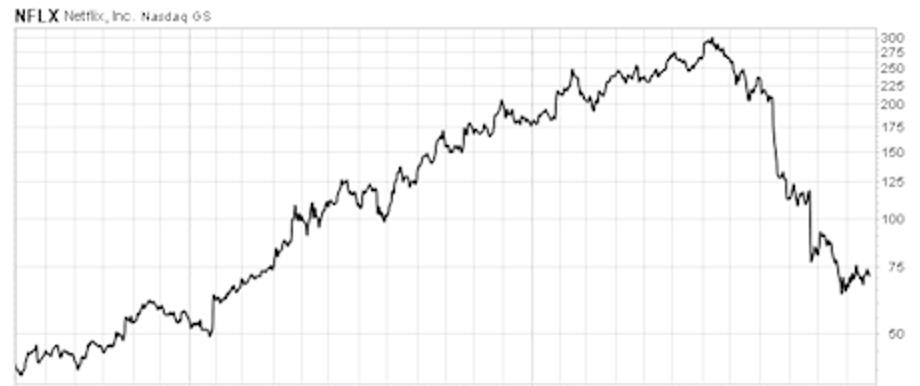
As you can see on this chart, NFLX grew from less than $50 per share to $300 over a 3-year period. That’s a 600% return on investment. A $5,000 investment in 100 shares of NFLX would have ballooned to $30,000.
What was the reason for this move and how many investors were able to capitalize on it? What if I told you that none of that really matters? What if the answer was as simple as finding an “X” on the charts?
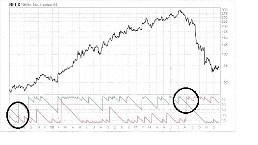
Look at the indicator at the bottom of the chart. On August 7, 2009 the green line shot up straight through the red line, forming an “X”. That is your signal to buy.
If you bought on August 7, 2009 you would have seen your investment grow 6-fold in two years.
On August 5, 2011, the red line broke up through the green line, forming another “X”. That is your signal to sell.
If you didn’t heed the 2nd “X”, the sell signal, you would have seen 65 percent of your gains erased.
Forget the fundamentals of the stock. Don’t worry about the news. None of this matters. Simply follow these rules:
- “BUY” when the green line shoots up through the red line, forming an “X”
- “SELL” when the red line shoots up through the green line, forming a second “X”
Let’s take a look at another example:
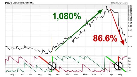
Growlife, Inc. (PHOT) is a tiny company that has emerged as a big player in the controversial, yet booming medical marijuana industry. The firm supplies medical marijuana growers with hydroponic equipment, lighting, nutrients, and even marketing for this rapidly expanding industry.
On September 11, 2013, the green line shot up through the red line forming the first “X”. Time to buy. Over the next 7 and a half months, an investment in PHOT gained 1,080%. A $1,000 investment in PHOT would have grown to $10,080 in just over 7 months.
Knowing when to exit a trade is just as important as knowing when to buy. On April 24, 2014, the redline shot up as the green line fell, forming the second “X”. Time to sell. If you decided to ignore the second “X”, you would have watched 86.6% of your gains erased.
Now, it's not hard to imagine what could've caused this jump in the price of Growlife. After all, it was a top story during that October and November.
Colorado and Washington were beginning to accept license applications to sell medical marijuana, and the U.S. Justice Department publicly announced they would not intervene in this formerly illegal industry in these two states.
This opened up the floodgates for a new legion of customers – all clamoring for Growlife's products.
And, thanks to this increasing popularity, during a late 2013 announcement, the company revealed its earnings had jumped 278% over the prior year.
How to pick Winners
Discovery of Hidden X-Pattern: "You will, with 100% certainty, only buy stocks that are going up"
But none of that matters...
Growlife's stock had entered a state of high velocity before Colorado and Washington began accepting medical marijuana licenses. This state of high velocity also occurred before insider information about this company's financial successes became public knowledge.
So anybody waiting around for the news would've missed out on a good bit of those 1,080% gains.
And one final example, this time with a more conventional stock:
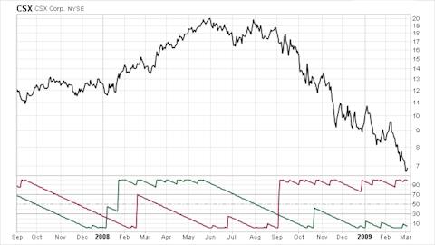
CSX Corp. (CSX), the railroad behemoth entered a phase of high momentum on January 7, 2008. The green line shot up through the red line, forming the first “X”. Time to buy.
CSX then shot up 45% over the next eight months. On September 3, the red line shot through the green green line, forming the second “X”. Time to sell. If you ignored this signal, you could have lost a considerable chunk of money.
So, how often does a stock form a BUY “X” Signal?
According to Keith FitzGerald, Chief Investment Strategist at Money Morning, based on a six-month investigation of winning trades , the first “X”, the “BUY” signal for a chart, has appeared on 2-3 stocks per month, every month, for the past 15 years.
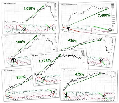
Take a look at even some of the most exceptional gains in the stock market. As you can see, it’s really as simple as buying on the first “X” and selling on the second “X”.
How does the Red and Green Indicator Work?
The secret behind the X all comes down to a formula...
Here it is.
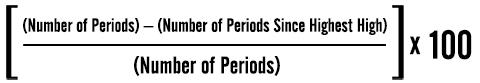
- You take the number of periods for the stock.
- Next, you subtract the number of periods since that stock hit its highest high.
- Then, you divide that by the number of periods again.
- And finally, you multiply that answer by 100.
While that may seem like a mouthful, it is important for you to at least understand the big picture.
So two spots are marked "Number of Periods."
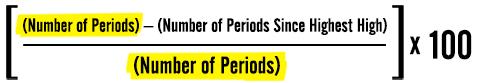
That's simply the adjustable window of time the formula uses to determine the strength of both momentum and gravity. To keep things simple, let's use 100 – meaning 100 days.

We're looking to find the right time frame to base a specific trade on.
Now, I've highlighted part of this formula labeled "Number of Periods Since Highest High."
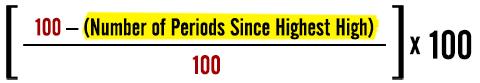
What this represents is the number of days that have passed since this stock's share price reached its 100-day high point for the green momentum line.
Now, for the red line, it's the same formula – you are just calculating the number of days since this same stock's share price reached its 100-day lowest low point.

So after you crunch the numbers you take these scores and you create trend lines for both the green and red lines.
At two points these two lines will meet – meaning both forces are equal.
Then, at the first point, the green line will continue shooting straight up as the red line falls.
The first X will appear.
When they meet again – the red line will be the one rising, as the green line is falling.
Their paths will cross, creating the second X.
Just like you see here.
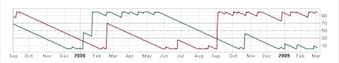
These two Xs generally signal a 48-hour window for when you should enter and exit a trade.
Conclusion
Just like the treasure maps in the pirate books, the charts can give the exact locations to find impressive, high velocity moves in almost any stock. When you see the first “X”, it’s time to buy. When the second “X” appears, it’s time to sell.
“X” marks the Spot!
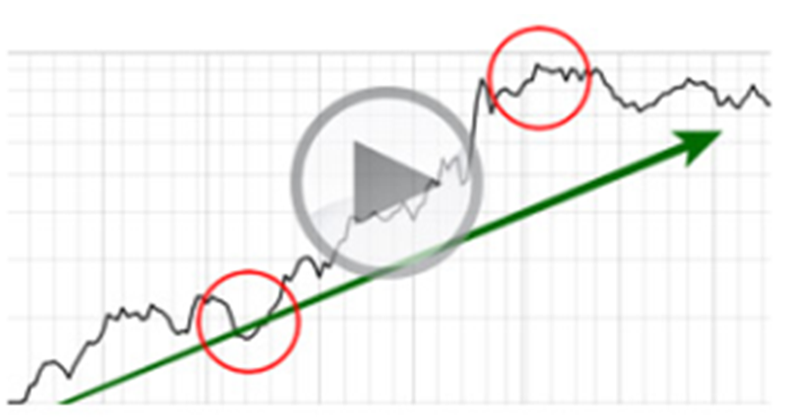
THE MOVIE
Market Phenomena Revealed
Wall street investment strategist discovers a mysterious "X-Patterns" in winning stocks
Keith Fitz-Gerald, Founder of“High Velocity Windfalls”, walks you through multiple examples of this simple, yet powerful strategy. At the end of the presentation you will have the opportunity to take a low cost special offer that will allow you to receive Keith’s invaluable research and start trading this strategy tomorrow!
THE SPECIAL OFFER