big book of indicators man vs machine
How to Get the Most Out of This Book

Thank you for accessing the Big Book Of Indicators: Man Vs. Machine. This book is designed for beginning, intermediate and advanced traders. The authors in this book are leading experts in trading Stocks, Options, Futures and Forex markets.

As you read this book, you will be exposed to multiple strategies that have high probabilities of success and/or high profit. Most of the strategies in this book are divided into three sections:

There are thousands of dollars’ worth of trading tools, indicators, training and mentoring services, books and videos available at steeply discounted prices. In short, you will have all of the information you need to trade your new favorite strategy tomorrow. Some of the things you will learn in this book are:

At  52patterns.com it is our sincere hope that you take away several strategies that you can use when you are done reading this book. You will also learn about markets that you currently don’t trade, and you will find out if they are suited to your trading personality.

Finally, make sure to subscribe to 52patterns.com. We provide free ebooks, on-demand videos and many other publications for active traders. Our presenters are world-renowned industry experts and our content is provided free of charge in a relaxed and friendly setting. Cheers to your trading success!

Chapter
01

6 Key "Market Based" Inputs

By Mike Ryske, NetPicks.com

When most of us hear the phrase “indicator”, we usually think about technical indicators like Moving Averages (EMA and SMA), the Relative Strength Index (RSI), Stochastics, and the MACD (among others). And while these may be effective in helping to determine the direction a market is moving in - or where to enter and exit a trade – they are not always helpful when make decisions on placing an options trade.  This requires more of an understanding of market based indicators, or as I like to call them, the 6 key inputs that drive the options pricing model.

If you are a trader or investor you can probably remember back to when you first got introduced to the markets. “Buy low / sell high.” “Invest for the long term in companies that you know and understand and who have good fundamentals.” These are some of the common methodologies taught in business schools and promoted by financial planners. As a result, in many cases, traders go into trading options with the same approach. Buying long calls and puts as a way to play the markets moving up or down is a common starting point. The problem with this approach is that buying long calls or puts is much different than buying or selling shares of stock. The prices of these options are influenced by other factors than just stock direction. Understanding how these different factors influence the price of an option can really help you improve your trading results in the long run.

The option pricing model actually has 6 different inputs which can influence the movement in your options. While stock price is a big input in the price of an option, there are other factors in play that are crucial to understand if you desire to see success with your trading. The 6 inputs in the pricing model of an option are Stock Price, Strike Price, Time to Expiration, Volatility, Interest Rates and Dividends. We are going to talk about Volatility and Time to Expiration in more detail as these two can cause the biggest issues with the way many retail traders use options.

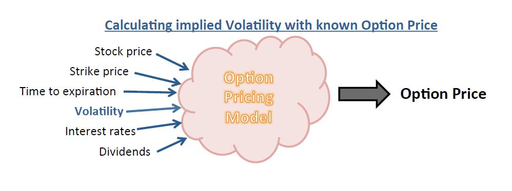
Of the 6 inputs that go into the option pricing model, 5 can be easily determined. Stock price, strike price, time to expiration, interest rates, and dividends are easily found. The one wild card is volatility, as it is constantly changing throughout each trading session.

The pricing model actually works backwards to determine which level of volatility is being used to generate the current price of an option. It takes the 5 known inputs and backs them out of the current option price being quoted to get the volatility. This is known as Implied Volatility. In order to trade options successfully it’s important to understand when Implied Volatility is high or low for each product that you trade. If you don’t understand volatility, then you could potentially see a directional move in your favor and still not make money. This would happen if you were long a call option and got a move higher in the stock but a drop in implied volatility. This could result in a lower profit return or even worse no profit at all.

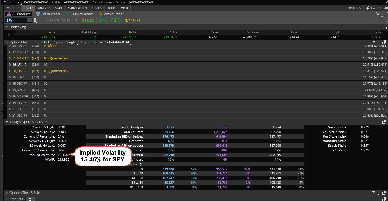
We teach our students to let the markets determine which options we decide to trade. What we mean here is we want to buy options when volatility is low and sell them when it’s high. How do we know what’s high and what’s low when it comes to volatility? The way we do it in the Thinkorswim platform is to use the IV Percentile tool. This can be found on the trade page under the ‘Today’s Options Statistics’ box towards the bottom of the trade page. This number compares the current level of Implied Volatility being used to the levels of volatility that have been seen on that product over the last 52 weeks. Anything above the 50th Percentile means Implied Volatility is high while any reading below the 50th Percentile means Implied Volatility is low.

The reason we like to let volatility guide us is we are taking the view that over time the 50th Percentile will act as a magnet and will pull volatility towards it. When the volatility is high we will go to the premium collection strategies in our playbook. This includes selling vertical spreads which is one of our favorite strategies. When Implied Volatility is high and we sell premium we are actually increasing our odds of success if volatility drops. This happens because as volatility drops the options will get cheaper, which will allow us to close our short premium trades for more profit. It’s giving us more ways of being profitable.

When Implied Volatility is below the 50th Percentile we will focus on buying premium. This is the case because if we get volatility to expand higher towards the 50th Percentile that will actually help our options increase in value faster.

If you can program yourself to follow volatility closely you will vastly increase your chances of success. Instead of just buying a long call or put on each trade and hoping for the best, you will actually give yourself a better opportunity to make money if the market doesn’t do exactly what you are looking for.

The second input in the options pricing model that many options traders don’t pay enough attention to is Time to Expiration. We know that trading options is much like buying an insurance policy. Each day that we don’t make a claim our policy loses value that we don’t get back. Trading options is much the same way. The longer you hold an option the less value it will have due to the time decay. You can actually limit the effect of time decay by going farther out in time. This is due to the fact that time decay moves in a nonlinear fashion. In other words, the closer you get to expiration the more value the option will lose each day that you hold it.

Knowing this about time decay means we can place trades with better odds of success by going farther out in time. Many traders will look to the weekly options which expire each Friday because they are very inexpensive when compared to the options that expire once a month. However, when trading the weekly options you have to understand the time decay can have a big factor on your trades. Instead of putting on trades that don’t have a large margin for error, I encourage our students to go out 20-40 days at a minimum. This will limit some of the effect of time decay and will allow you to hold your positions longer without the time decay eating away at those positions.

If just blindly buying calls and puts, you are going to face an uphill battle over time with your options trading. Sure you will have some really great winners from time to time but ignoring factors like Implied Volatility and Time Decay will ultimately lead to frustration. It will be hard for you to hit the consistent profits that we all want over time. However, flip the cards around and let these factors work in your favor and I think you will be amazed at how the growth in your account will improve.

3 Options Strategies for More Profits

  1. Long Call or Put

    When buying a long call or put, we need to make sure we have a strong opinion on which way the stock or ETF is headed in the near term. We have to keep in mind that whenever we buy an option the clock is ticking the second we decide to initiate the trade. The time decay will start to add up and potentially eat into the profit potential that we have. This means not only do we need to be right on market direction, but the move needs to happen in our favor quick enough.

    To combat some of the negative features of buying an option, we like to be very picky with the criteria that we use when selecting the call or put option. First, we don’t pick the option based on what we can afford like so many retail traders make the mistake of doing. In many cases, this will leave you with an out of the money option which has a very low probability of success. Instead, we like to trade the in the money options.

    Our criteria has us going out 20-40 days until expiration and buying the call or put option that is 1-2 strikes in the money. This criterion is the same whether we are trading AAPL, BA, or C. By using the same criteria on all stocks and ETF’s, we are able to take much of the discretionary decisions out of the equation.

    For example, back in June our Options Fast Track system gave us a long setup on one of the volatility ETF’s (Symbol: VXX). The entry point was at $14.15 on the chart. Instead of tying up the capital buying the shares of stock once the entry point was hit, we decided to buy the July 13 call options for $1.93 or $193 per contract. The options had between 20-40 days left until expiration and the 13 calls were one strike in the money from the entry point.

    For less than $200 we were controlling 100 shares of stock with the call option. This is a perfect example of the leverage that options offer us. Regardless of the account size you are working with, this is a trade that will leave you with very little capital at risk.

    We were fortunate enough in this case that VXX did go up and hit our full target at $16.67. Once this level was hit, we sold out of the long call position for $4.00 per contract. This gave us a profit of $207 per contract or a return of 107%. That’s a great profit that can give a quick boost to a small account.

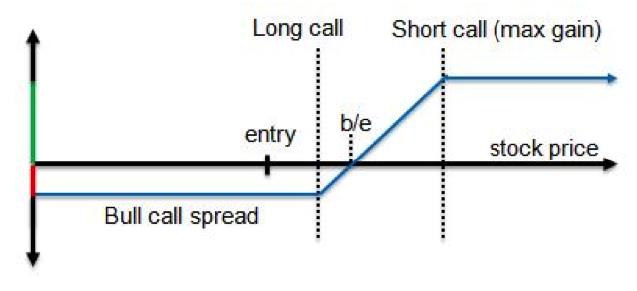
  2. Long Vertical Spread

    There are times when I want to make a directional bet but do so with a more conservative trade. This is where the long vertical spread comes in. Out of all trade types, the Vertical Spread is my favorite as it is the most flexible strategy when it comes to trading options. When using a long vertical spread, we still need to have a strong opinion on which way the stock or ETF is heading in the near term. While the time decay is still going to be there like with a long call or put, the long vertical spread is able to limit the effect of that time decay slightly.

    We like to use the long vertical spread when we are less sure of market direction. We are able to do this because a long spread is constructed by both buying an option and selling an option with a different strike at the same time. Vertical spreads offer a unique ability to control risk and reward by allowing us to determine our maximum gain, maximum loss, breakeven price, maximum return on capital, and the odds of having a winning trade, all at the time we open a position.

    When setting up a long vertical spread we still like to trade the options that have between 20-40 days left until expiration. We structure the trade by always buying the option that is 1 strike in the money and then selling the strike that is closest to our target for that stock or ETF in the near term. The nice part about using this simple criteria is that it is the same when using call or put options. The criteria is also the same regardless of the symbol of the stock we are trading.

    For example, back in June we had our Options Fast Track system giving us a short setup on Tesla (Symbol: TSLA) with an entry point at $227.98. Instead of going in and short selling the shares of stock, which could tie up thousands of dollars or capital, we decided to look at trading the options.

    Buying a long put option is one way of playing the market when it is moving to the downside, but it would also tie up too much capital on the TSLA trade (over $2000 of capital per contract). So what else could we do? We decided to look at buying the July 230/210 put spread for $7.45.

    This trade had us buying the July 230 put and at the same time selling the 210 put. We paid $7.45 or $745 per spread. We still controlled 100 shares of TSLA stock on the downside but by using the put spread instead of buying the long put we were able to cut our cost by over 50%. This is still a bearish trade so we make money if the stock moves lower. Our risk is limited to the price that we paid for the spread which was $745 per spread. The trade off here is we will be left with a smaller winner if the trade does hit the target on the chart.

    In our example, the trade did go down and hit full target on the chart at $212.86. Once this level was hit, we closed the trade by selling the put spread for $11.90. This gave us a profit of $445 per spread or a 60% return.

    Here is a great example of using options to open the door to some of the expensive tech stocks for a fraction of the price. Don’t feel like you are backed into a corner trading the cheap stocks because you have a small account size. Use the long vertical spread to go where the action is without tying up thousands of dollars of capital.

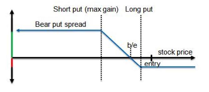
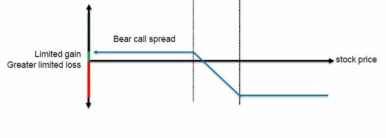
  3. Short Vertical Spread

    Trading long calls and puts or a long vertical spread give us great ways to put on an aggressive trade when we have a strong opinion on market direction in the near term. What if we are a little less certain of market direction? Selling vertical spreads to open a position can give us a way of scratching out a profit even in a period of choppy price action. We do this by selling an option that is closer to the current price of the stock and then going out and buying an option with a strike price that is farther out of the money. By doing this, we are still able to be in a risk defined position but it also gives us multiple ways of being profitable. Let’s take a look at the criteria that we use when selling a vertical spread to open a position.

    When selling vertical spreads to open a trade we still like to use options with between 20-40 days left until expiration. Why do we prefer to go out farther in time? In most cases the monthly options will have more volume and open interest when compared to the weekly options. This will make them easier to get in and out of trades at good prices.

    Going out to the monthly options will also give us more time to be right just in case the market moves against us initially. This gives us time to recover while the weekly options don’t give us that flexibility.

    When selling spreads, we like to collect as close to 40% of the width of the spread as possible. For example, back in early June we saw that the Real Estate ETF (Symbol: IYR) was overbought and we felt it was due for a pullback. However, I was less sure on the timing of the move and didn’t want to be super aggressive by buying a put or put spread. Instead, I wanted a trade that would make money if IYR moved lower or got choppy.

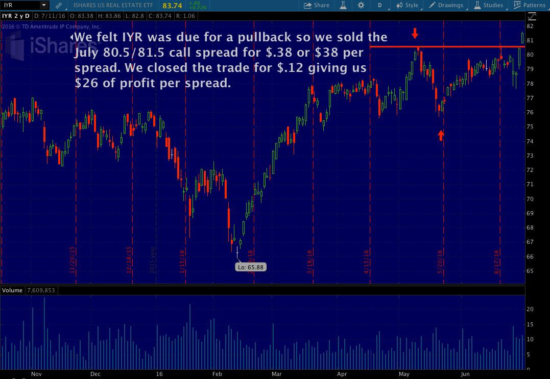
    We went out to the July monthly options and we sold the July 80.5/81.5 call spread to open the position. This had us selling the 80.5 call and buying the 81.5 call at the same time to make it a risk defined trade. We collected $.38 or $38 per spread to put this trade on. This $38 was the most we could have made on the trade, while our risk was limited to $62 per spread (difference between the 81.5 and 80.5 strikes minus the $.38 collected to put the trade on). Our break even point on this trade was at $80.88 (short 80.5 call plus the $.38 collected to put the trade on).

    Why would we risk $60 to make $40? That doesn’t sound like a very good risk to reward ratio. The reason we would like a trade like this is it would allow us to make money 5 different ways:

    1. We make money if IYR moves slightly higher as long as price closes below $80.88 
    2. We make money if IYR moves lower as long as price closes below $80.88.
    3. We make money if IYR moves sideways as long as price closes below $80.88.
    4. We make money as the time decay adds up each day that we hold the trade.
    5. We make money if the implied volatility contracts.

    In our case, we were fortunate that IYR did move lower, time decay did add up, and volatility decreased. As a result, we were able to close this trade out by buying the spread back for $.12 or $12 per spread. This gave us a profit of $26 per spread. While that doesn’t seem like a lot of profit, remember we only tied up $62 of capital to begin with. You could have put this trade on 10 times and still had less than $650 of capital at work.

    It’s important to note that the criteria outlined above is the same for both short call spreads and put spreads. By having a rule set in place, it allows us to be more consistent and eliminate much of the discretionary decisions that so many retail trades get stuck on.

    Selling vertical spreads to open positions is a very powerful approach that many retail traders miss out on. While short spreads are not the holy grail of trading, they give us the flexibility that we need to make money in any type of market condition that comes our way.

Risk Management - Position Sizing

Now that we have 3 options strategies that we can use to take trades right away, the next step is to determine how much risk we can take. One of the biggest reasons for traders failing to reach their profit goals is taking position sizes that are way too big. I hear it all the time from newer students. “If I just hit a few big winners the whole game changes for me.” The approach is completely backwards thinking. When trading with a small account size it’s crucial to focus on consistent growth over time. If you can focus on small winners on a regular basis you will see the power of compounding take over.

I would also much rather see a newer trader take 5-6 small positions instead of 1-2 big positions. With any trading system out there the statistics become more significant as the sample set of trades becomes larger. If you are just taking 1 or 2 trades at a time, it becomes a long shot to see the results you are looking for. However, if you are taking 5-6 trades now all the sudden we can get more diversification built in and also build our sample set of trades larger to make sure the odds are in our favor.

Having a risk management rule in place is crucial to trading success. I have included a sample risk management template below. This is a very similar plan that I use in my own trading.

Sample Risk Template:

Determine what % of your account size you are willing to have at risk.

In my plan I use the 50% number. This rule says I will not have more than 50% of my account size at risk at any one time. If I am using a $10,000 account this means I can’t have more than $5,000 at risk across all my different positions. So I have $5,000 to work with spread across the 10 names on my watch list. If I reach that $5,000 limit and I get new trades to set up, then I need to either close out of some existing trades to free up capital in order to get back below the $5,000 level or skip the trade.

The 50% number works for me and is a level I am comfortable with. That number could be different for you. It could be 25% or 60%. The number doesn’t matter to me as long as you are comfortable with that level of risk and it’s something you can stay disciplined to following.

Initially, you will want to try and keep the risk spread evenly across all the names on your list. Don’t let one name on your list dominate your P/L. For example, trading one contract on GOOGL is not the same as trading one contract on C. In this case the outcome of the GOOGL trade will dominate your P/L.

The risk doesn’t have to be equal to the penny across all your trades but don’t let it get too far out of line. Overweighting certain sectors from time to time will work fine as long as you are comfortable with the risk. Never get into the situation where the outcome of one trade impacts your ability to take the next trade. Remember, we are looking for consistent long term success with our trading.

What’s the takeaway?

As traders we want to be as diversified as possible. This means a diversified list of products on our watch list, but also a diversified list of trade types as well. We all love to trade the long calls and puts as they give us a ton of profit potential quickly on any big market move. However, we also have to realize that the market doesn’t always move for us. So we want to make sure we have safer trades on like a short vertical spread which will allow us to make money if the market stays slow and sideways. Don’t limit your trading to the basic strategies just because you are working with a small account size. There are great trades that you can place with very little capital that will allow you to stay active in all market conditions. The more you mix up your trade types the more consistency you will see in your results long term.

THE SPECIAL OFFER

FREE Crash Proof Options Training Includes...

  •   Pinpoint Trade Accuracy:  Always know the best option contract to choose in your trade
  •   How you can Protect your assets and grow your trading account
  •   How to succeed in all market conditions - whether the markets crash, continue higher or go sideways

Click here to get your "Crash Proof Options" survival guide

ABOUT THE AUTHOR

Mike started trading back in 2002 as a finance major in college. It was quickly apparent during one of his first business classes that there was great wealth to be made in the stock market. Not one to be patient and wait for his degree to start making money, Mike discovered the great leverage that can be used in the options markets. This allowed him to start trading options with a very small account size while still in college.

Mike found success early in his trading career and decided to take the leap into full time trading soon after. Along the way, he had to learn many lessons the hard way like so many retail traders can relate to. It wasn’t until a visit to the floor of the CBOE (Chicago Board Options Exchange) that he realized he had to put a system in place that he could stay disciplined to.

Mike discovered the NetPicks trading systems back in 2006 and quickly became a customer. This was the missing piece to the puzzle. This has allowed him to trade full time for a living ever since. After learning the systems inside and out over the span of the next 2 years, Mike joined the NetPicks team as a trading coach in 2008. He quickly became the resident options expert and has been Lead Options Instructor ever since. While he has dabbled in other markets over the years, trading options has become his go to market. Mike has worked with thousands of traders since 2008 and enjoys the opportunity to help others reach their trading goals.

Chapter
02

“X” Marks the Spot: A New Way to Capitalize on Major Stock Moves

Cam White, ChartExperts.com

In my youth, I used to love reading books and watching movies about pirates and buried treasure. Sooner or later, someone would discover the treasure map, leading to a wild adventure to find the buried treasure chest. In most of these swashbuckling tales, the location of the buried gold was marked with an “X” on the map.

How many times have you looked at a major move in a stock, and asked yourself “Wow, what if I had gotten in on that stock early? I would have made a killing!”

You look at the stock and rationalize why the stock moved. Maybe it was based on a strong earnings report. Maybe a new drug got approved, or there was a pending merger or acquisition. Regardless of what caused the move, many investors sit on the sidelines and watch the move happen without pulling the trigger. What if there was a way to find out exactly where to capture the lion’s share of a major stock move without guesswork?  

Let’s take a look at Netflix (NFLX) in 2009

As you can see on this chart, NFLX grew from less than $50 per share to $300 over a 3-year period. That’s a 600% return on investment. A $5,000 investment in 100 shares of NFLX would have ballooned to $30,000. 

What was the reason for this move and how many investors were able to capitalize on it? What if I told you that none of that really matters?  What if the answer was as simple as finding an “X” on the charts?

Look at the indicator at the bottom of the chart. On August 7, 2009 the green line shot up straight through the red line, forming an “X”. That is your signal to buy.

If you bought on August 7, 2009 you would have seen your investment grow 6-fold in two years. 

On August 5, 2011, the red line broke up through the green line, forming another “X”. That is your signal to sell.

If you didn’t heed the 2nd “X”, the sell signal, you would have seen 65 percent of your gains erased.

Forget the fundamentals of the stock. Don’t worry about the news. None of this matters. Simply follow these rules:

  • “BUY” when the green line shoots up through the red line, forming an “X”
  • “SELL” when the red line shoots up through the green line, forming a second “X”

Let’s take a look at another example:

Growlife, Inc. (PHOT) is a tiny company that has emerged as a big player in the controversial, yet booming medical marijuana industry. The firm supplies medical marijuana growers with hydroponic equipment, lighting, nutrients, and even marketing for this rapidly expanding industry.

On September 11, 2013, the green line shot up through the red line forming the first “X”. Time to buy. Over the next 7 and a half  months, an investment in PHOT gained 1,080%. A $1,000 investment in PHOT would have grown to $10,080 in just over 7 months.

Knowing when to exit a trade is just as important as knowing when to buy. On April 24, 2014, the redline shot up as the green line fell, forming the second “X”. Time to sell. If you decided to ignore the second “X”, you would have watched 86.6% of your gains erased.

Now, it's not hard to imagine what could've caused this jump in the price of Growlife. After all, it was a top story during that October and November.

Colorado and Washington were beginning to accept license applications to sell medical marijuana, and the U.S. Justice Department publicly announced they would not intervene in this formerly illegal industry in these two states.

This opened up the floodgates for a new legion of customers – all clamoring for Growlife's products.

And, thanks to this increasing popularity, during a late 2013 announcement, the company revealed its earnings had jumped 278% over the prior year.

How to pick Winners

Discovery of Hidden X-Pattern: "You will, with 100%
certainty, only buy stocks that are going up"

But none of that matters...

Growlife's stock had entered a state of high velocity before Colorado and Washington began accepting medical marijuana licenses. This state of high velocity also occurred before insider information about this company's financial successes became public knowledge.

So anybody waiting around for the news would've missed out on a good bit of those 1,080% gains.

And one final example, this time with a more conventional stock:

CSX Corp. (CSX), the railroad behemoth entered a phase of high momentum on January 7, 2008. The green line shot up through the red line, forming the first “X”. Time to buy.

CSX then shot up 45% over the next eight months. On September 3, the red line shot through the green green line, forming the second “X”. Time to sell. If you ignored this signal, you could have lost a considerable chunk of money.

So, how often does a stock form a BUY “X” Signal?

According to Keith FitzGerald, Chief Investment Strategist at Money Morning, based on a  six-month investigation of winning trades , the first “X”, the “BUY” signal for a chart, has appeared on 2-3 stocks per month, every month, for the past 15 years.

Take a look at even some of the most exceptional gains in the stock market.  As you can see, it’s really as simple as buying on the first “X” and selling on the second “X”.

How does the Red and Green Indicator Work?

The secret behind the X all comes down to a formula...

Here it is.

  • You take the number of periods for the stock.
  • Next, you subtract the number of periods since that stock hit its highest high.
  • Then, you divide that by the number of periods again.
  • And finally, you multiply that answer by 100.

While that may seem like a mouthful, it is important for you to at least understand the big picture.

So two spots are marked "Number of Periods."

That's simply the adjustable window of time the formula uses to determine the strength of both momentum and gravity. To keep things simple, let's use 100 – meaning 100 days.

We're looking to find the right time frame to base a specific trade on.

Now, I've highlighted part of this formula labeled "Number of Periods Since Highest High."

What this represents is the number of days that have passed since this stock's share price reached its 100-day high point for the green momentum line.

Now, for the red line, it's the same formula – you are just calculating the number of days since this same stock's share price reached its 100-day lowest low point.

So after you crunch the numbers you take these scores and you create trend lines for both the green and red lines.

At two points these two lines will meet – meaning both forces are equal.

Then, at the first point, the green line will continue shooting straight up as the red line falls.

The first X will appear.

When they meet again – the red line will be the one rising, as the green line is falling.

Their paths will cross, creating the second X.

Just like you see here.

These two Xs generally signal a 48-hour window for when you should enter and exit a trade.

Conclusion

Just like the treasure maps in the pirate books, the charts can give the exact locations to find impressive, high velocity moves in almost any stock. When you see the first “X”, it’s time to buy. When the second “X” appears, it’s time to sell.

“X” marks the Spot!

Market Phenomena Revealed

Wall street investment strategist discovers
a mysterious "X-Patterns" in winning stocks

Keith Fitz-Gerald, Founder of “High Velocity Windfalls”, walks you through multiple examples of this simple, yet powerful strategy. At the end of the presentation you will have the opportunity to take a low cost special offer that will allow you to receive Keith’s invaluable research and start trading this strategy tomorrow!

Watch this Video to see the x Pattern in Action

Chapter
03

High Profit Candlestick Signals and Patterns

Stephen W. Bigalow, CandlestickForum.com

As long as buyers and sellers have been trading the markets, two predominant sentiments have been in play: fear and greed. Centuries ago, Japanese rice traders developed the candlestick method to graphically depict trader sentiment. It has worked successfully for hundreds of years, and still works today. Candlestick analysis can help you make better trading decisions about investor sentiment in the markets.

As long as buyers and sellers have been trading the markets, two predominant sentiments have been in play: fear and greed. Centuries ago, Japanese rice traders developed the candlestick method to graphically depict trader sentiment. It has worked successfully for hundreds of years, and still works today. Candlestick analysis can help you make better trading decisions about investor sentiment in the markets.

The Japanese rice traders didn’t just become wealthy using candlesticks, they created legendary wealth trading a basic commodity. This method works for any trading instrument as long as the basic human emotions of fear and greed are involved – which pretty much covers every market.

Candlestick analysis prepares you to be ready for big price moves based on historic results of specific signals and patterns. It’s simply a graphic depiction of investor sentiment. The Japanese rice traders gave us not only the benefit of knowing what the signals look like, but they also described what the investor sentiment was behind each signal There are 50-60 signals to learn, but eight of the most successful candlestick signals will be discussed in this lesson.

The most beneficial thing about candlesticks is that they help identify trends.

But first, to help identify trends, you need a few indicators. Here’s what they are:

  • Red Line: 200 day simple moving average (SMA)
  • Blue Line: 50 day simple moving average
  • Gray Line: 20 day simple moving average

These indicators are important because every money manager in the world uses these indicators to help them make decisions when trading their portfolios.

The most important indicator is the T-Line, which is the 8 Exponential Moving Average (EMA). The T-Line has some very simple rules:

  • If you see a candlestick BUY signal ABOVE the T-Line, you are in an UPTREND
  • If you see a candlestick SELL signal BELOW the T-Line, you are in a DOWNTREND

Stochastics are used to indicate overbought and oversold conditions. If you see a candlestick BUY signal in an oversold condition, there is a strong probability that you are going to be going into an uptrend. Conversely, if you see a candlestick SELL signal in an overbought condition, you are likely heading into a downtrend. The settings that I use for stochastics are 12,3,3. These settings have worked the best for what I do most of the time, which is swing trading.

Summing it up, if you plot the 200, 50, and 20-day Simple Moving Averages, along with the 8 Exponential Moving Average, and stochastics set at 12, 3, 3 – then you are good to go. Let’s see how these indicators work with candlestick patterns:

In this daily chart, the stochastics are in an overbought condition with candlesticks above the T-Line. Once they turn red and break through the T-Line, a downtrend is established until a Morningstar pattern at the bottom triggers a reversal to the upside.

The rest of this chapter will be devoted to the top bullish candlestick power signals. If you know them and can identify them you will have a much better handle on identifying trader sentiment.

The Top Eight Bullish Power Signals

  1. Your Best Friend
  2. Left/Right Combo
  3. Series of Doji’s
  4. Candlestick Patterns followed by Gap Ups
  5. Kicker Signal
  6. Bullish Flutter Kicker
  7. Steady Eddie Trends
  8. Magnitude of a Signal

Your Best Friend

A Doji occurs whenever the market opens and closes at the same level during a particular time frame.

  • Doji Star: Small price movement. 
  • Long-legged Doji: If the price movement is huge, but the bar closes where it opened.
  • Dragonfly Doji: Where the price opens and closes at the top of the bar.
  • Gravestone Doji: Where the price opens and closes at the bottom of the bar. It got its name from Japanese soldiers pressing on in battle only to retreat back to camp.

A derivative of the Doji is the Spinning Top. Spinning Tops are characterized by short candle bodies with short wicks, similar to the child’s toy. Spinning tops signal indecision between the bulls and the bears in the marketplace. When you see a spinning top or Doji at the top, you want to consider taking profits. If you see them at the bottom, there’s likely to be an uptrend.

A Doji in an oversold area, followed by a gap-up, gives you a very strong probability that you are about to enter a strong uptrend. The beauty of candlesticks again is that they capture investor sentiment. When you are at the bottom of the market in oversold territory, as indicated by stochastics, and a Doji appears, it signals indecision. If it is followed by a strong gap-up, closing above the T-Line, then a strong uptrend is building.

One caveat to this strategy is that when the candlesticks start moving well above the T-Line, they are going to want to come back to the T-Line, so you want to be prepared to take profits if necessary.

To summarize, here are the optimal criteria for the “Best Friend: scenario:

  1. Look for the signals
  2. Stochastics oversold
  3. Gap-up from the Doji signal. The bigger the Gap-up the stronger the uptrend
  4. Close above the T-Line

Note: At the end of this chapter, click on the YouTube presentation of this topic for many more examples of the “Best Friend” bullish signals in action.

Left/Right Combo

The Left/Right Combo is a Doji followed by a bullish engulfing signal. The bullish engulfing signal completely encapsulates the previous candle body. Since the Doji body is small, it represents a moment of indecision followed by a clear bullish move. The Left/Right Combo is like a boxer setting up a small left jab with a roundhouse right punch. In this example we have a small Doji, followed by a bullish engulfing signal and a strong upward move in the stochastics. Notice there is a series of Dojis in this chart. If one Doji signals indecision, a series of Dojis indicates greater indecision. If you see a strong candlestick buy signal, followed by a series of Dojis and the next bar gaps-up significantly, a strong bullish move is in play, and you want to be buying.

Series of Dojis

Remember that a Doji represents indecision. If you see a series of Dojis it represents greater indecision. When you see a series of Dojis setting up, and stochastics start moving up, with candlesticks closing above the T-Line, it signals a positive open the following day and trigger to buy. Bear in mind, you still need to do your due diligence. Make sure to check the pre-market futures the next day, and make sure there isn’t any economic or geopolitical news that could adversely impact your decision to buy. But if the futures are moving in the same direction as your trend, it’s a signal to proceed and buy.

Candlestick Patterns followed by Gap-Ups

Any signal followed by a gap-up is a signal to buy. In this case, we have a hammer signal, followed by a bullish gap up. Once the candles close above the T-Line along with a corresponding upward move in the stochastic, it signals a strong buying trend.

When we see a gap-down in an oversold condition it’s just telling you that most people panic when the market is at the bottom. How can you tell if the market is at its bottom? With candlestick patterns, once you see a gap-down in an oversold condition, start looking for signs of a reversal. It could be a Doji, a series of Dojis or a gap-up reversal.

Bullish Kicker Signal

The strongest of all buy signals is the Bullish Kicker Signal. This is when the market is in a downtrend, and the following bar opens in a gap-up above the previous day’s high. This pattern signals that investor sentiment has been kicked the other way.

In this example, there is a significant gap-up above the previous day’s downtrend. The gap-up is well above the T-Line and there’s a strong upward move in the stochastics. This signals a very strong change in investor sentiment.

Some traders are afraid to buy after a significant gap-up. They are afraid that they are buying at a high. Remember, if the stochastics are rising and the candlestick is above the T-Line, then the upward trend is likely to continue. Bear in mind that the further the candles drift north of the T-Line, the more likely they are to retrace and come back to it. Bullish kicker Signals don’t require a gap-up as long as it is a significant move in the opposite direction of a downtrend, and it’s moving above the T-Line with supporting stochastics. As a rule of thumb, the bigger the Bullish Kicker Signal is, the more significant the move will be.

Bullish Flutter Kicker

A Bullish Flutter Kicker occurs when the market has a down day followed by an indecisive gap-up. If you see a Doji gapping-up over the previous days open, it’s a signal that the market is showing some strength. If the market moves up the next day over the previous days close and starts moving above the T-Line, it’s a signal that investor sentiment is moving the market into an uptrend. If you remove the Doji from the picture, you would have a Bullish Kicker Signal with a strong gap-up.

Steady Eddie Trends

When you see a gap up through a resistance, in this case, the 200-day moving average, it signals the start of a “Steady-Eddie” trend, and it’s a great place to be. The candlesticks will ride above the T-Line for an extended period of time signaling multiple opportunities to let profits ride. You can rest every night knowing that the market will continue to rise until you see a close below the T-Line. Once again, the further the candlesticks drift above the T-Line, the more likely they are to return to the T-Line. Once the Candlesticks start crossing back below the T-Line is when you need to start thinking about making a course correction.

Magnitude of the Signal

The larger the signal, especially after a Doji, the more compelling the evidence is that there is a change in investor sentiment. In this example, the candles formed a rounded bottom and broke above the 50-day moving average resistance level, followed by a very large gap-up above the T-Line. Once a gap-up like this happens, the market will more than likely form a 45-degree “Steady-Eddie” pattern, where the market churns upward above the T-Line.

Whenever you see a large gap in candlestick patterns as shown above, it’s a sign of a strong move. If you can identify it, your earnings will multiply.

Summary

Candlestick patterns are a historical gauge of investor sentiment. They were developed centuries ago by Japanese rice traders and they still work today. If you study these bullish candlestick patterns and can identify them, you will prepared to act on decisive changes in investor sentiment. You will be in a much better position to enter into an uptrend, set stop/losses and ride your profits to the upside.

The tools you need are simple and straightforward:

  • The  T-Line = the 8 Exponential Moving Average (EMA)
  • 20, 50 and 200 Day Simple Moving Averages(SMA)
  • Stochastic Oscillator (settings are 12,3,3)

Follow the rules in this lesson, and you will trade with better certainty. You will have a better handle on investor sentiment and will know when to enter and exit a trade.

THE MOVIE

Watch the Video of this Presentation (highly recommended) If you like what you’ve read in this lesson and want more information, then you owe it to yourself to spend an hour watching this free presentation, courtesy of TradingPub. There are several more examples of these candlestick patterns in this video that will give you a better understanding how they work.

THE SPECIAL OFFER

As a bonus, Steve offered a special $12 offer for his Candlestick Precision Major Signals Education Package that will include:

  • Stephen’s Candlestick Precision Major Signals Education Package – comprised of 12 videos that dissect each of the major signals to illustrate where and when they work most effectively in a trend, (a $581 value)
  • You will also receive 30 complimentary days in my Candlestick Forum Membership site, granting you access to a wealth of trading information and training. (a $97 value)
  • PLUS, you will receive immediate access to over $335 worth of E-books, videos and special bonuses when you activate your FREE 30-day membership.

Get the Major Signals Education Package for just $12.00 HERE (a $581 value)

ABOUT THE AUTHOR

Sephen W. Bigalow possesses over twenty-five years of investment experience, including eight years as a stockbroker with major Wall Street firms: Kidder Peabody & Company, Cowen & Company and Oppenheimer & Company. This was followed by fifteen years of commodity trading, overlapped with twelve years of real estate investing. He holds a business and economics degree from Cornell University, and has lectured at Cornell and at many private educational investment functions over the past twenty years.

Mr. Bigalow has advised professional traders, money managers, mutual funds and hedge funds, and is recognized by many in the trading community as the “professional’s professional.” He is an affiliate of the “Market Technicians Association”. (mta.org – A non-profit association of professional technical analysts) and a member of AAPTA, the American Association of Professional Technical Analysts. (aapta.us)

Chapter
04

The Rise of Wealth Hacking Using Artificial Intelligence

By Dan Mirkin and David Aferiat, Trade-Ideas.com

The real way to hack wealth, to become wealthy, is to be in the stock market. Know another?

It's not real estate. With real estate you need a huge amount of capital to gain wealth and if your real estate holdings are your primary residence and/or a rental, it can take years before realizing gains. Start your own business? We say go for it, but it’s a full-time effort and takes its blood, sweat and tears. The equities market is the only place with the available liquidity flexible enough to put capital into the market - and get it back out. However not every approach in the equity markets works.

I can tell you one thing that is 100%: you cannot become wealthy by indexing yourself and ETF-ing yourself, you have got to be a stock-picker. You've got to find the stocks that move. And that's why we're here. Trade Ideas has been around since 2003. We have our computers looking for what can be done by people to gain wealth. Our arrays of servers do tons of practice trades all throughout the night to see what is and isn't working. And we do it for about a million different opportunities. So every night, while you're sleeping we’re at work. It’s automated preparation meant to arm you with an information advantage. Preparation used to mean going through charts, which makes no sense because that's the past and you need to be more focused on what's happening today. Something we call the Investment Discovery Engine, Holly.

So our computers go through approximately a million simulations every night to come up with the best statistical ideas of what you should be doing today. One of the ways our brains think about stocks is there's this desire to know the “why” of everything and then to invest. But that's just not the scientific approach: the “why” can figure itself out much later. What you need to do is understand how to manage yourself and how to manage risk to take advantage.

This overview of the Trade Ideas solution describes how opportunities are identified and how to make the technology part of your new preparation routine.

This second video describes in more detail The OddsMaker, the event-based backtesting tool that’s optimized and repeated to test millions of scenarios.

This is wealth-hacking: it's MGT at $4 stock that I purchased thanks to Trade Ideas at 87c. Look at my risk for 1000 shares: $870. It went from 87c to $4 – a 357% gain. Now compare that to the gains you picture in your mind when you think about money in general and what the industry has kind of fed down your throat. Think about that for a minute. You're used to hearing that “3%”, “5%”, “7% is a lot”... This has been constantly reiterated and reiterated and reiterated by the people whose interest it is to keep your expectations pretty darn low.

Finding opportunities like MGT are great. Big and small wins (as well as the occasional, risk appropriate loss) should be shared so that best practices and lessons can be learned. In other words don’t trade alone. Fortunately you don’t have to. At Trade Ideas we have a thriving Trader’s Room community in the hundreds that celebrate learning and transparency. It’s moderated by a customer-turned employee, Barrie, who keeps the conversation focused on spotting what’s happening.

Each day a recap of the Trader’s Room activity shows how well the community did. Never trading alone also means continuous learning. Each month Trade Ideas produces a segment called Jamie’s Trading Studio, which presents an in depth view of how market opportunities are identified by artificial intelligence and how to trade the ideas.

Trade Ideas’ mission is to arm investors with the confidence that comes from an information advantage. An advantage that gives you not just the idea, but the plan with which to trade it - when to get in and when to get out.

See for yourself. We’re so confident that you’ll see the information advantage at Trade Ideas and change the way you see the markets forever, we’ll give you our Trade of the Week with your email. In The Trade of the Week we show you how we identified the trade, why we believe it will perform well based on the chart, and the technical conditions that are in place for the stock at this time.

THE SPECIAL OFFER

Here’s a special offer of 15% off if you want to jump in on any SUBSCRIPTION PLAN

  Use the code WINNING for 15% off through September 30.

ABOUT THE AUTHORS

Dan Mirkin has been a pioneer and driver of new technology in the financial marketplace for over 15 years. After graduating from the University of Texas, Dan Mirkin started a hedge fund specializing in active trading of index derivatives.

In 1995 Dan Mirkin became entrenched in the Direct Access trading technology revolution. He contributed to the design and testing of CyberTrader, the first commercially viable Direct Access trading platform, acquired by Charles Schwab for $400 million USD in 2000. In 1998 Mr. Mirkin founded FutureTrade Technologies in an effort to bring Direct Access technology to the institutional market.

In June of 2002 Dan Mirkin left FutureTrade to start Trade Ideas LLC. Having spent nearly 3 years talking with hedge fund managers about what makes them trade, Dan saw the need for a next generation research tool. A tool that automated what successful traders and portfolio managers did throughout the day and continuously brought important market events to users’ attention. Trade Ideas streaming alerts allow users to monitor vast amounts of market data in real-time without constraining system resources. Anyone that has a browser and internet access can immediately start using the product.

David Aferiat brings more than 15 years of experience in trading, consulting, software, utilities, capital markets, and consumer product industries.

Working with senior officers and key decision makers in the boardroom, finance, HR, marketing and trading functions, he has advised both public and privately held companies with revenues ranging from $20 million to $14 billion. Work at Trade-Ideas taps experience in business development, customer acquisition and retention, corporate strategy as well as energy trading and marketing.

David holds dual Bachelor of Arts degrees in Economics and French from the University of Texas at Austin and a Masters of Business Administration degree from the Cox School of Business at Southern Methodist University.

In seven years Trade Ideas has grown to over 50,000 accounts in 19 different countries. Hedge funds, Asset Managers, Institutions, Online Brokers, and direct access traders use the software as a premier idea generation, risk management, and decision support tool.

Chapter
05

My Favorite Ways for Predicting Market Turns

Rob Booker, RobBooker.com

Introduction

It's not easy to predict a market turn. But knowing how to do it is an important part of trading.

Being able to accurately predict a market turn can:

  • Create big trades, at the point where new trends start
  • Help you get out of trades that have gone bad
  • Make you look cool at cocktail parties (LOL)

In this post I'll show you my favorite ways to predict a market turn.

Method #1:  Long-Term Divergence

My favorite method for predicting a market turn is to watch for divergence on the weekly and monthly charts.

Let's look at an example from the currency market, and then the stock market.

Here's a weekly chart of the currency pair EUR/GBP:

In June of 2015, the EUR/GBP was falling - but the Relative Strength Index was rising.

Traders were selling EUR/GBP, but the rate at which they were doing it had decreased. This was an early warning sign of a big reversal.

Now, let's look at Apple.

In this chart, I've removed the RSI from the bottom to make it easier to see the trades.

At point of the recent major reversal points for AAPL, weekly divergence showed up.

If we simply add a trendline to the chart - and wait for that trendline to break before the trade, we can catch huge moves lower.

Some Notes About Divergence: Divergence can be tricky. It shows up often on short-term charts, and that can create a lot of "false alarms." So when looking for major reversals, it's best to stay on the weekly - or even the monthly - charts.

Method #2:  Multiple Missed Pivots

My favorite method for predicting a market turn is to look at missed pivots. Sometimes I lie awake at night and think about missed pivots. (Yes, I know I’m a weirdo).

A pivot point is an average price. A monthly pivot point is last month's high, low, and closing prices, added together, and then divided by three. Your charts can automatically calculate a monthly pivot.

A missed monthly pivot is not hit by price during the month that it is created.

The Rule: Watch for 2 or more missed monthly pivots in a row. Then wait for a trendline break or divergence to take the trade. Then let your friends wonder, "How did she see this turn in the market coming?"

Oil gives us a perfect example:

In the example above, you can see that for two months, the price of oil did not touch its monthly pivot. (It's easy to know that a pivot is missed - no price is touching it during the month that it is created).

When price falls even farther, and then bullish divergence appears on the chart - it's time for a buy. Not surprisingly, this is when oil bottomed out in February of 2016. So-called "experts" were calling for oil to drop even farther. They should have been looking at missed pivots.

Method #3:  Yearly Pivots

You want to find huge market turns?

Look at yearly pivots.

Take what we've already learned above - to look for missed monthly pivots - and apply it yearly pivots.

See the USD/JPY currency pair below:

This is my chart from an actual trade, so there's lots of writing all over the place.

I'll walk you through it step by step.

  1. The USD/JPY missed its 2013, and 2014, and 2015 yearly pivots. This means that the bullish trend was so strong that price never hit the yearly pivots in the years they were created.
  2. It would have been enough that 2 yearly pivots were missed, but in this case, 3 yearly pivots were missed! This is a huge deal and it's a massive reversal pattern!
  3. Once bearish divergence formed, and the highest trendline was broken, it was time to start trading.
  4. The target on the trade was the 2015 OR the 2014 yearly missed pivots - thousands of points below.

These trades don't come often, but when they do, they're awesome. These are the biggest trades of my life. I once made $164,000 on a trade on the GBP/CHF with this same method – but that’s a story for another time.

Here’s what to do, right now:

Take a look at any stock that's been moving in one direction for a long time, and missing yearly pivots. Facebook (FB) is doing this right now, and I’m planning a monster short on this stock for the 4th quarter of 2016.

If you find one of these, you’ve got giant trade on your hands. As I mentioned, Facebook is doing this right now.

Method #4:  Pin Bar on a Weekly/Monthly Chart

You want to find reversals INSIDE of a trend? So that you can take bigger and better trend trades?

Look at pin bars on the weekly (or monthly) charts.

pin bar is a candle formation that has a longer-than-average wick, and a small body. I'll explain why they're so powerful and how they're formed in just a moment. They're easy to find once you start looking for them.

NOTE: I am not a pin bar expert. I’m not a pinball expert. Keep in mind, as you read further, that you might have a different definition for a pin bar. That’s ok.

Pin bars happen all the time on short term charts (like 5 minute or tick charts).  They don’t appear frequently on weekly or monthly charts. But when they do appear, they're awesome trend-continuation patterns.

Here's a look at Facebook, on the weekly chart from January of 2016:

The green candle (circled above) is sending a massive alarm that the trend is about to continue.

  1. Price dropped hard, but traders then bid the stock back up. This creates the long wick extending out the bottom. We could buy immediately on the completed formation of the pin bar and place a protective stop underneath the long wick.
  2. The very next candle was a huge up move - this is further evidence that traders want to buy Facebook, not sell it. This gives us confidence that we've traded with the flow of money, not against it.
  3. The pin bar appears on top of the yearly pivot - this is (in my opinion) the absolute best way to trade a pin bar formation - right off a pivot, which acts as a springboard or launching pad for price.

Warning: Lots of traders argue about what constitutes a "true" pin bar. This sounds like the most boring argument in the world. I would rather shoot myself in the face than argue about pin bars. Here’s what I do to find them: I simply look for a candle with a long wick, much longer than recent wicks. And the wick must extend far outside of recent price action. And it must occur on top of or next to a long term pivot. That's all I care about.

Putting it All Together

Successful traders put multiple concepts together to create a personalized trading strategy.

Here's how you might approach trading major market reversals:

  1. Pick a mix of 30-40 financial instruments from all market sectors and asset classes. You'll be looking at longer-term charts, so you'll need some energy, bonds, stocks, commodities, and currencies in the mix. ETFs can work great as proxies for commodities or stock sectors.
  2. Pick a method you like, and stick with it. Maybe you like divergence + pivots. Great! Stay with it for at least six months or a year. Most traders change what they are doing so often, they never give a single method a chance to succeed.
  3. Decide on a money management plan. I talk more about this in the course, but here's a short primer: Decide what your max risk will be on each trade, and place a protective stop on every trade, and never violate that stop-loss boundary. Then decide what amount of profit you'll target - and place a limit order to exit the trade at that price. Use a combination of break-even stops or trailing stops to protect your trade along the way. 

THE SPECIAL OFFER

Further Study/More Trades

CLICK HERE to get Rob’s indicators for your charts and to access his brand new course on predicting Market Turns

ABOUT THE AUTHOR

Rob Booker has traded the markets for nearly 15 years and is a former commodities trading advisor and money manager, as well as the founder of the TFL365.com.

He currently hosts The Trader’s Podcast (available on iTunes) and is the author of the book  Adventures of a Currency Trader: A Fable about Trading, Courage, and Doing the Right Thing.  

He is passionate about helping traders become successful and consistent in their efforts and is committed to continuously  provide valuable insights to them.

Chapter
06

Using “Archer” Technology to Identify Pending Orders and Predict Price Movement

Brian Sorrentino, DayTradeXchange.com

“ARCHER”, is proprietary trading software referred to by DTX futures traders as a “forecasting indicator”. It’s uniquely designed to detect and alert the trader of “pending order” accumulations at specific market prices. “Pending orders” are trades in waiting that are executed at some time in the future provided that the market returns to the targeted entry price.

When market conditions produce repeating identifiable trading patterns called trading ranges, it attracts increased numbers of traders that will attempt to take advantage of the pattern predictability by “parking” their buy or sell orders in front of the pattern. This causes the “pending orders” to accumulate while waiting for the market to return and trigger their entry. ARCHER monitors the accumulation of these “parked orders” and uses the data to predict potential volume surges in trade execution that may strongly influence the future price movement of the market.

Today’s trading indicators attempt to predict future price movement based on historical trade data, (trades that have already happened). ARCHER predicts price movement based on trading activity that is about to happen. Linked directly to the Chicago Mercantile and Commodities Option Exchanges (CME, CBOT and CBOE), ARCHER is uniquely designed to recognize buildups of “pending orders” that could produce volume surges with the potential of influencing price movement in either a short or long direction. ARCHER signals the trader in advance allowing them to profit by placing their order ahead of the forecasted volume surge and subsequent price movement.

Historical vs Non- Historical Data Based Indicator’s 

ARCHER uses no historical trade data. The ARCHER algorithm monitors a set of data profiles (including Pending Orders), that are happening in real time or are about to happen in the near future. ARCHER then alerts the user to the price that institutions are about to execute their buy or sell contracts. Most importantly is that no matter the market the user is trading (S&P, RUSSELL. OIL, NYMEX, etc.), they can adjust the dollar valuation sensitivity alert oscillator to their threshold of choice.

 For example, depending on the market being traded the user can set the alert threshold to any amount applicable to that market, ($1, 2, 3, 8, 12, or $20 Million or $1 Billion). Originally designed to run as an automatic high speed trading program designed to manage the exit and entry feathering maneuvers of potential price impacting portfolio positions (hedge funds), the Company deployed ARCHER as a day trading program in a modified version to capture the interest of a massive international day trading market (scalpers). The BOD determined that introducing ARCHER in this strategy would be the most expeditious and cost effective way to reach 10’s of millions of financially involved persons whom would experience capital return success that until ARCHER, had been elusive to individuals but, typically available to institutional investors.

DXT research has revealed that there is no day trading platform typically used by today’s day traders that offer a Non-Historical Data Based trading indicator. Every single indicator offered on global day trading platforms such as NINJA, TradeStation, E-Trade, Scottrade, TD Ameritrade, Option House, Trade King, etc., only use historical executed trade data to produce a visual depiction of what’s about to happen in the market. They attempt to predict the future based only, on what’s happen in the past. ARCHER changes this for the day trader equipping them with the same algorithmic trading advantages used by institutions.

 “ARCHER”2.1
Automatic Dollar Valuation of Pending Order

The ARCHER software program is adaptable to all index markets and individual stock equities like Apple or Amazon.  This upgraded version of the original now includes an adjustable oscillator capable of detecting different dollar value thresholds of pending order accumulations.  This allows the user to simultaneously track both the pending order positions of hedge funds and institutions (macro scale order accumulations), and the smaller customary pending order accumulations typical in routine wave trading activity.

For example, the trader can now set the pending order accumulation threshold at $10 MM on one chart and $2MM on a second chart. The $10 MM threshold will identify the extreme high or low price boundaries of the market. These extreme resistance and/or support boundaries are caused by the mass accumulations of pending “buy or sell” orders typical of hedge fund and large banking institution activity. The $2MM chart will give the trader the ability to trade the smaller wave pattern (or stair step pattern), that routinely develops as the general market travels between the outside or extreme price boundaries set by the institutions. “To our knowledge, no other indicator available to Day Trader’s today offers this type of insight to market activity. If you want to have a decent chance of success at day trading, you must know where the institutions (big money), is lining up to buy or sell their contracts. ARCHER lets you see them” said Sorrentino, CEO of Day TradeXchange. We invite everyone to take 2 minutes and click the link below to watch todays “Trade of the Day”. Visit the DTX YouTube page and you’ll quickly understand what the buzz is all about. 

DTX Trade of the Day

Watch the DTX Trade of the Day Video Here

“To my knowledge, this is one of the most advanced forecasting indicators available to day traders today. It’s not that prediction technology hasn’t been around. Institutions have had it for years but, this is the first time a non-historical based prediction indicator has been available to the general day trading market. It’s a game changer for the non-institutional trader; you know, the regular guy”, said Sorrentino, the CEO of Syndication Inc.

TRADING PHLOSOPHY - DTX vs OTHER TRADING ROOMS

Trading for a Living:  Where to Start?

Why do the vast majority of traders fail when they take on the task learning how to day trade?  Is it because they did not educate themselves enough through reading trading books?  Perhaps they did not go to enough seminars (online or a live attended events).  Perhaps it is because they did not purchase the right system or signals from a reputable vendor.  Or maybe it is because they were not lucky enough to meet a veteran trading mentor that would take them under their wing and show them the way.

The truth is that it is a little of each and then some.  Educating yourself with the basics of trading is important.  Reading books on trading is helpful.  Buying courses can also be helpful, even if you do not make money with a specific course.  Having a mentor can be very helpful as well, although difficult to find. 

Looking back at my 20yr full time trading career I have concluded that all of the reading and research and exposure to trading was helpful to me in finally understanding what it takes to become a consistent profitable trader.  During my first 10yrs educating myself on day trading I read hundreds of books about day trading.  I began to realize that if a single book procured a single nugget of valuable information it was a book worth the read.  No single book I have ever read contained entire sequence of what must be done in order for someone to become successful at day trading. 

One thing I am certain about is that I never read a single book that outlined exactly what is required to day trade successfully.  I am not sure why this is, but I guess I attribute this to the logic that people who write day trading books don’t actually know how to day trade successfully.  So they do the next best thing and that is, write a book.  Much less risky.  This does not mean the books are not worth a read.  Some of the best educators in day trading do not know how to actually day trade.  That does not mean you cannot learn something from them.

Regardless of what kind of system you use, whether it is 100% technical analysis or some combination of technical analysis/fundamentals, there are common underlying techniques that must be understood and applied precisely.  There is not a lot of room for error here.

  • The most common process for person who begins the process of embarking on a day trade career is to:
  • Educate him/herself by reading a few “bible” trading books;
  • Possibly attending a few seminars, online or in person;
  • Experimenting with an endless list of indicators/oscillators;
  • Developing a “system”/signal(s);
  • Optimize that system/signal continuously;
  • Anytime the signal failed, exclude it by changing the parameters of the signal;
  • And at the end of maybe a year, after countless tweaks and optimizations, realizing that they are back at the original signal they developed initially.(many of you know exactly what I am talking about);
  • Purchasing a course/Trading Room;
  • Countless ways this goes wrong from phantom trading to reckless extending stops and averaging in (which works 80% of time till it doesn’t);

Trading Rooms are a lot like guys who write books.  They really do not know how to trade profitably themselves so they do the next safest thing, write a book or start a trading room.  This does not mean you can’t learn something from SOME trading rooms.  The danger is blowing out your account because of one bad trade. 

So what’s missing from all this?  Why do most traders fail?  The answer is simple to say and hard to do.  Let me tell you a short story that explains perfectly what is missing.

One of my first systems/signals I developed almost 15yrs ago was loosely based on a few indicators and “wave” pattern.  I did fairly well with it a majority of the time but then it just “stopped working” for a period of time.  And then like magic it began to pull profits again.  Inevitably I would lose most or all of my gains.  Fast forward to present:  I use this exact same signal now and it is consistently highly profitable.  So what happened?  Did the markets change?  No, I changed.  I finally understood why it did not work sometimes and worked beautifully others.

You see, all/most traders when developing a signal/system, do the same thing.  They spend 99% of their time developing a signal, a really good signal.  A signal that is bullet proof in all markets.  A signal that is the Holy Grail.  Most traders spend virtually no time considering two very important aspects of a system.

  • Risk management (what do I do when things go wrong)?
  • What type of market is this signal appropriate for?

I have yet to see any signal that works for all types of markets:

Risk Management:  We have all read enough books where we can parrot off the, don’t risk more than 2% of account value (absolutely meaningless bit of information IMO), 1:2 risk/reward minimum (good information but how does one apply that to any particular market or signal?  Every signal requires a modified risk management.  Every different market requires a different risk management.  Changes in a particular markets volatility requires a different risk management.  This is an area that trader across the board fail miserably.

What type of market am I applying the signal to:  Markets basically are of 4 types (Trending volatile, trending non-volatile, Range bound/consolidating volatile and Range bound/consolidating non-volatile).  I have yet to see a single signal that can successfully be applied to all 4 of these markets.  Because of the way signals are designed and the internal mechanics of a signal will almost by definition preclude it from one or more of these types of markets. 

If a trader is unable to understand this principle and is also unable to identify what type of market they are trading, their results we most definitely be varied with any one signal.  Time frames also play a very important role in identifying what type of market one is about to trade.   What may seem like a trending market in a 1 minute time frame may look considerably different in a larger time frame.  That market can become very range bound.  Then the trader has to identify the volatility of each in order to make a proper risk assessment (i.e., is the trade worth putting real money on the line?).

Of all the books I have read, I have never read one that tied this all together.  If they had, I am guessing the author would not be writing a book about it but rather trading.  The truth is I have never taken a course in trading, but I have been in the industry long enough to realize from stories, that the trading rooms are also falling short on this fundamental aspect.

All of us at DayTradeXchange.com believe that we have an effective and simple solution for your trading.  It’s called ARCHER.

ARCHER software is not based on historical data like most other indicators. Archer software is PREDICTIVE technology.  ARCHER is working behind the scenes to calculate the exact points for you to get in AND, out of the market. The Teachers at DayTradeXchange.com understand how to apply ARCHER software to the appropriate market as well as utilizing risk management in a precise way.  All of these vital aspects have finite variables (not discretionary) applied so they can be taught to anyone, while offering complete trading transparency.

THE SPECIAL OFFER

There is one last aspect of day trading that traders have a difficult time mastering.  The truth is some can never master for various reasons.  Some traders do not have the temperament while others embark on this journey with far too little capital.  All of this falls into the psychology of day trading.  Proper coaching and moderation in trading rooms can influence this aspect tremendously, but ultimately it takes time and dedication to master this.  We want to make it easy for you to succeed.  That’s why we are offering a special discount to everyone who joins our trading room in the next 2 weeks.

Click Here to Join Our Live Trading Room

Day trading offers a wonderful lifestyle and the opportunity to improve one’s life.  I personally put in a lot of time developing my skills.  There were points where I almost threw in the towel.  I am glad I did not.  I am confident that DaytradeXchange can help you become the trader you always dreamed you could be and start REALLY, trading for a living.

ABOUT THE AUTHOR

Brian Sorrentino serves as the Chief Executive Officer and Chairman of the Board of Day TradeXchange Inc..With 29 years of trading and managing experience, Mr. Sorrentino has worked in the securities industry since 1986 and has been licensed series 6, 7, and 24.

In 1993, he founded Source Management Services, a consulting company specializing in material acquisition and mergers and he currently serves as co-leader for Maryland’s 6th District, of T. Boone Pickens National Energy Organization.

Chapter
07

TRADING ICHIMOKU CLOUD PATTERNS “Learn how to read any market and any timeframe within 3 seconds”

By Manesh Patel, Ichimoku Trade

Quick Description

Ichimoku Kinko Hyo is a purpose-built trend trading charting system that has been successfully used in nearly every tradable market. It is unique in many ways, but its primary strength is its use of multiple data points to give the trader a deeper, more comprehensive view into price action. This deeper view, and the fact that Ichimoku is a very visual system, enables the trader to quickly discern and filter "at a glance" the low-probability trading setups from those of higher probability.

History

The charting system of Ichimoku Kinko Hyo was developed by a Japanese newspaperman named Goichi Hosoda. He began developing this system before World War II with the help of numerous students that he hired to run through the optimum formulas and scenarios -- analogous to how we would use computer-simulated backtesting today to test a trading system. The system itself was finally released to the public in 1968, after more than twenty years of testing, when Mr. Hosoda published his book, which included the final version of the system.

Ichimoku Kinko Hyo has been used extensively in Asian trading rooms and has been used successfully to trade currencies, commodities, futures, and stocks. Even with such wild popularity in Asia, Ichimoku did not make its appearance in the West until the 1990s and then, due to the utter lack of information in English on how to use it, it was mostly relegated to the category of another "exotic" indicator by the general trading public. Only now, in the early 21st century, are western traders really beginning to understand the power of this charting system.

Equilibrium at a Glance

The name Ichimoku Kinko Hyo translates to "Equilibrium chart at a glance." Here’s how it’s used.

While Ichimoku utilizes five separate lines or components, they are not to be used individually, in isolation, when making trading decisions, but rather used together to form an integrated "whole" picture of price action that can be gleaned "at a glance." Thus, a simple look at an Ichimoku chart should provide the Ichimoku practitioner with a nearly immediate understanding of sentiment, momentum and strength of trend.

Price action is constantly measured or gauged from the  perspective of  whether it is in relative  equilibrium or disequilibrium. Hosada  strongly believed that the market was a direct reflection of human group dynamics or behavior. He felt that human behavior could be described in terms of a constant cyclical movement both away from and back towards equilibrium in their lives and interactions. Each of the five components that make up Ichimoku provide its own reflection of this equilibrium or balance.

The Ichimoku chart is composed of five separate indicator lines.

These lines work together to form the complete "Ichimoku picture." A summary of how each line is calculated is outlined below:

The Senkou span A and B deserve special mention here as they, together, form the Ichimoku “kumo” or cloud. We cover the kumo and its myriad functions in more detail in the kumo section.

The chart below (FIGURE 1) provides a visual representation of each of these five components:

FIGURE 1 - Ichimoku Components

 Ichimoku Settings

As you can see in the Ichimoku Components section above, each line calculation has one and sometimes two different settings based on the number of periods considered. After much research and backtesting, Goichi Hosoda finally determined that the settings of 9, 26 and 52 were the ideal settings for obtaining optimum results with Ichimoku. He derived the number 26 from what was then the standard Japanese business month (which included Saturdays). The number 9 represents a week and a half and the number 52 represents two months.

The standard settings for an Ichimoku Kinko Hyo chart are 9, 26 and 52.

There is some debate around whether or not these settings of 9, 26 and 52 are still valid given that the standard work month in the West does not include Saturdays. In addition, in non-centralized markets that do not keep standard business hours like the Forex (which trades around the clock), some have posited that there may be more appropriate settings.

Nevertheless, EII Capital, as well as most other professional Ichimoku traders, agree that the standard settings of 9, 26 and 52 work extremely well and do not need to be altered.

The argument could be made that, since Ichimoku Kinko Hyo functions as a finely-tuned, integrated whole, changing the settings to something other than the standard could throw the system out of balance and introduce invalid signals.

Tenkan Sen

The Tenkan Sen, as mentioned, is calculated in the following manner:

(HIGHEST HIGH + LOWEST LOW)/2 FOR THE PAST 9 PERIODS

While many may compare the tenkan Sen to a 9-period simple moving average (SMA), it is quite different in the sense that it measures the average of price's highest high and lowest low for the last nine periods. Hosoda believed that using the average of price extremes over a given period of time was a better measure of equilibrium than merely using an average of the closing price. This study of the tenkan sen will provide us with our first foray into the key aspect of equilibrium that is so prevalent in the Ichimoku Kinko Hyo charting system.

Consider the chart in Figure 1 below:

FIGURE 1 - Tenkan Sen vs. 9-Period SMA

As can be seen in the chart, the tenkan sen often exhibits "flattening" whereas the 9-period SMA does not. This is due to the fact that the tenkan sen uses the average of the highest high and lowest low rather than an average of the closing price. Thus, during periods of price ranging, the tenkan sen will clearly show the midpoint of the range via its flat aspect. When the tenkan sen is flat, it essentially indicates a trendless condition over the last 9 periods.

It can also be seen how the tenkan sen provides a much more accurate level of price support than does the 9-period SMA. With only one exception, price action stayed above the tenkan sen in the three highlighted areas of the chart, while price broke below the SMA numerous times. This is due to the more conservative manner in which the tenkan sen is calculated, which makes it less reactive to small movements in price. On a bearish chart, the tenkan sen will likewise act as a level of resistance.

The angle of the tenkan sen can also give us an idea of the relative momentum of price movements over the last nine periods. A steeply angled tenkan sen will indicate a nearly vertical price rise over a short period of time or strong momentum, whereas a flatter tenkan sen will indicate lower momentum or no momentum over that same time period.

The tenkan sen and the kijun sen both measure the shorter-term trend. Of the two, the tenkan sen is the "fastest" given that it measures trend over the past nine periods as opposed to the kijun sen's 26 periods. Thus, given the very short-term nature  of  the  tenkan  sen,  it  is  not  as  reliable  an  indicator  of  trend  as  many  other  components  of  Ichimoku. Nevertheless, price breaching the tenkan sen can give an early indication of a trend change, though, like all Ichimoku signals, this should be confirmed by the other Ichimoku components before making any trading decision.

One of the primary uses of the tenkan sen is its relation to the kijun sen. If the tenkan sen is above the kijun sen, then that is a bullish signal. Likewise, if the tenkan sen is below the kijun sen, then that is bearish. The crossover of these two lines is actually a trading signal on its own, a topic that is covered in more detail in the Ichimoku Trading Strategies section.

Kijun Sen

The kijun sen is calculated in the following manner:

(HIGHEST HIGH + LOWEST LOW)/2 for the past 26 periods

The kijun sen is one of the true "workhorses" of Ichimoku Kinko Hyo and it has myriad applications. Like its brother, the tenkan sen, the kijun sen measures the average of price's highest high and lowest low, though it does so over a longer time frame of 26 periods as opposed to the tenkan sen's nine periods. The kijun sen thus provides us with all the information the tenkan sen does, just on a longer time frame.

Due to the longer time period it measures, the kijun sen is a more reliable indicator of short-term price sentiment, strength and equilibrium than the tenkan sen. If price has been ranging, then the kijun sen will reflect the vertical midpoint of that range (price equilibrium) via its flat aspect. Once price exceeds either the last highest high or lowest low within the last 26 periods, however, the kijun sen will reflect that by either angling up or down, respectively. Thus, short-term trend can be measured by the direction of the kijun sen. In addition, the relative angle of the kijun sen will indicate the strength or momentum of the trend.

Price equilibrium is expressed even more accurately in the kijun sen than in the tenkan sen, given the longer period of time it considers. Thus, the kijun sen can be relied upon as a significant level of price support and resistance (see highlighted areas in Figure II below).

FIGURE II - Kijun Sen Support

Price tends to move alternately away from and back toward the kijun sen in a cyclical fashion due to the kijun sen's strong expression of equilibrium or stasis. Thus, when price momentum is extreme and price moves rapidly up or down over a short period of time, a certain "rubber band" effect can be observed on price by the kijun sen, attracting price back towards itself and bringing it back to equilibrium.

 An analogy could be made between how price interacts with the kijun sen and how electricity always seeks to return to ground or zero potential. The "ground" in this case is the kijun sen and price will always seek to return to that level. This phenomenon is particularly evident when the kijun sen is flat or trendless, as can be seen in Figure III below:

FIGURE III - Kijun Sen "Rubber Band" Effect

Given the dynamics of the kijun sen outlined above, traders can use the kijun sen effectively as both a low-risk point of entry as well as a solid stop loss. These two tactics are employed extensively in both the kijun sen cross as well as the tenkan sen/kijun sen cross strategies which are covered in greater detail in our Ichimoku Trading Strategies section.

Chikou Span

The chikou span is calculated in the following manner:

CURRENT CLOSING PRICE time-shifted backwards (into the past) 26 periods

The chikou span represents one of Ichimoku’s most unique features, that of time-shifting certain lines backwards or forwards in order to gain a clearer perspective of price action. In the chikou span's case, the current closing price is time-shifted backwards by 26 periods. While the rationale behind this may at first appear confusing, it becomes very clear once we consider that it allows us to quickly see how today's price action compares to the price action of 26 periods ago, which can help determine trend direction.

If the current close price (as depicted by the chikou span) is lower than the price of 26 periods ago, that would indicate that there is a potential for more bearish price action to come, since price tends to follow trends. Conversely, if the current closing price is above the price of 26 periods ago, that would then indicate the possibility for more bullish price action to follow.

Consider the charts in Figures IV and V below:

FIGURE IV - Chikou Span in Bullish Configuration

FIGURE V - Chikou Span in Bearish Configuration

In addition to providing us with another piece of the "trend puzzle," the chikou span also provides clear levels of support and resistance, given that it represents prior closing prices. Ichimoku practitioners can thus draw horizontal lines across the points created by the chikou span to see these key levels and utilize them in their analysis and trading decisions (see Figure VI below).

FIGURE VI - Chikou Span Support and Resistance Levels

Senkou Span A

The Senkou span A is calculated in the following manner:

(TENKAN SEN + KIJUN SEN)/2 time-shifted forwards (into the future) 26 periods

The Senkou span A is best-known for its part, along with the Senkou span B line, in forming the kumo, or "Ichimoku cloud" that is the foundation of the Ichimoku Kinko Hyo charting system. The Senkou span A is another one of the time-shifted lines that are unique to Ichimoku. In this case, it is shifted forwards by 26 periods. Since it represents the average of the tenkan sen and kijun sen, the Senkou span A is itself a measure of equilibrium. Goichi Hosoda knew well that price tends to respect prior support and resistance levels, so by time-shifting this line forward by 26 periods he allowed the Ichimoku practitioner to quickly see "at a glance" where support and resistance from 26 periods ago reside compared with current price action.

Senkou Span B

The Senkou span B is calculated in the following manner:

(HIGHEST HIGH + LOWEST LOW)/2 for 52 periods time-shifted forwards (into the future) 26 periods

The Senkou span B is best-known for its part, along with the Senkou span A line, in forming the kumo, or "Ichimoku cloud" that is the foundation of the Ichimoku Kinko Hyo charting system. On its own, the Senkou span B line represents the longest-term view of equilibrium in the Ichimoku Kinko Hyo system. Rather than considering only the last 26 periods in its calculation like the Senkou span A, the Senkou span B measures the average of the highest high and lowest low for the past 52 periods. It then takes that measure and time-shifts it forward by 26 periods, just like the Senkou span A. This convention allows Ichimoku practitioners to see this longer term measure of equilibrium ahead of current price action, allowing them to make informed trading decisions.

While it is possible to trade off of the Senkou span A and B lines on their own, their real power comes in their combined dynamics in the kumo.

The Kumo Cloud

The Basics

The kumo is the very "heart and soul" of the Ichimoku Kinko Hyo charting system. Perhaps the most immediately visible component of Ichimoku, the kumo ("cloud" in Japanese) enables one to immediately distinguish the prevailing "big picture" trend and price's relationship to that trend. The kumo is also one of the most unique aspects of Ichimoku Kinko Hyo as it provides a deep, multi-dimensional view of support and resistance as opposed to just a single, uni- dimensional level as provided by other charting systems. This more encompassing view better represents the way in which the market truly functions, where support and resistance is not merely a single point on a chart, but rather areas that expand and contract depending upon market dynamics.

The kumo itself is comprised of two lines, the Senkou span A and the Senkou span B. Each of these two lines provides their own measure of equilibrium and together they form the complete view of longer-term support and resistance. Between these two lines lies the kumo  "cloud" itself, which is essentially a space of "no trend" where  price equilibrium can make price action unpredictable and volatile.

Trading within the kumo is not a recommended practice, as its trendless nature creates a high degree of uncertainty.

A Better Measure of Support and Resistance

As mentioned earlier, one of the kumo's most unique aspects is its ability to provide a more reliable view of support and resistance than that provided by other charting systems. Rather than providing a single level for support and resistance (S&R), the kumo expands and contracts with historical price action to give a multi-dimensional view of support and resistance. At times the kumo's ability to forecast support and resistance is nothing short of eerie, as can be seen in the chart below (Figure I) for USD/CAD, where price respected the kumo boundaries on five separate occasions over a 30-day span.

FIGURE I - Kumo Support & Resistance

The power of the kumo becomes even more evident when compared with traditional support and resistance theories. In the chart for Figure II below, we have added a traditional down trend line (A) and a traditional resistance line at 1.1867 (B). Price managed to break and close above both the down trend line and the single resistance level at point C. Traditional S&R traders would take this as a strong signal to go long with this pair at that point. A savvy Ichimoku practitioner, on the other hand, would take one look at price's location just below the bottom edge of the kumo and would know that going long at that point is extremely risky given the strong resistance presented by the kumo. Indeed, price did bounce off of the kumo and dropped approximately 250 pips, which would have most likely eradicated the long position of the traditional S&R trader.

Frustrated by his last losing trade, the traditional S&R trader spots another chance to go long, as he sees price break and close above the prior swing high at point D. The Ichimoku trader only sees price trading in the middle of the kumo, which he knows is a trendless area that makes for uncertain conditions. The Ichimoku trader is also aware that the top boundary of the kumo, the Senkou span B, is close at hand and may present considerable resistance, so he again leaves this dubious long trade to the traditional S&R trader as he awaits a better trade opportunity. Lo and behold, after meeting the kumo boundary and making a meager 50 pips, the pair drops like a stone nearly 500 pips.

The example given above illustrates how Ichimoku’s multi-dimensional view of support and resistance gives the Ichimoku practitioner an "inside view" of S&R that traditional chartists do not have. This enables the Ichimoku practitioner to select only the most legitimate, high-reward trade opportunities and reject those of dubious quality and reward. The traditional chartist is left to "hope" that their latest breakout trade doesn't turn into a head fake -- a shaky strategy, at best.

FIGURE II - Traditional S&R Theory vs. Ichimoku Kumo

Price's Relationship to the Kumo

In its most basic interpretation, when price is trading above the kumo, that is a bullish signal since it indicates current price is higher than the historical average. Likewise, if price is trading below the kumo, that indicates that bearish sentiment is stronger. If price is trading within the kumo, that indicates a loss of trend since the space between the kumo boundaries is the ultimate expression of equilibrium or stasis.

The  informed  Ichimoku  practitioner will normally first consult price's relationship to the kumo in order to get their initial view of a chart's sentiment. From a trading perspective, the Ichimoku chartist will also always wait for price to situate itself on the correct side of the kumo (above for long trades and below for short trades) on their chosen execution time frame before initiating any trades. If price is trading within the kumo, then they will wait to make any trades until it closes above/below the kumo.

Kumo Depth

As you will see upon studying an Ichimoku chart, the kumo's depth or thickness can vary drastically. The depth of the kumo is an indication of market volatility, with a thicker kumo indicating higher historical volatility and a thinner one indicating lower volatility. To understand this phenomenon, we need to keep in mind what the two lines that make up the kumo, the Senkou span A and the Senkou span B, represent. The Senkou span A measures the average of the tenkan sen and kijun sen, so its "period" is between 9 and 26 periods, since those are the two periods that the Tenkan Sen and Kijun Sen measure, respectively. The Senkou span B line, on the other hand, measures the average of the highest high and lowest low price for the past 52 periods. Thus, the Senkou Span A is essentially the "faster" line of the two, since it measures a shorter period of equilibrium.

 Consider the chart in Figure III below. For the previous 52 periods, price made a total range of 793 pips (from a high of 1.2672 to a low of 1.1879) The midpoint or average of this range is 1.2275 and that is thus the value of the Senkou span B. This value is then time-shifted forwards by 26 periods so that it stays in front of current price action. The Senkou span A is more reactive to short-term price action and thus is already reflecting the move of price back up from its low of 1.1879 in its positive angle and the gradually thinning kumo. The Senkou span B, on the other hand, is actually continuing to move down as the highest high of the last 52 periods continues to lower as it follows the price curve's move down from the original high of 1.2672. If price continues to rise, the Senkou span A and B will switch places and the Senkou span A will cross above the Senkou span B in a so-called "kumo twist".

FIGURE III - The Kumo and its Calculations

The kumo expands and contracts based on market volatility. With greater volatility (i.e., where the price of a given currency pair changes direction dramatically over a short period of time), the faster Senkou span A will travel along in relative uniformity with the price curve while the slower Senkou span B will lag significantly given that it represents the average of the highest high and lowest low over the past 52 periods. Thicker kumos are thus created when volatility increases and thinner ones are created when volatility decreases.

Kumo depth or thickness is a function of price volatility

From a trading perspective, the thicker the kumo, the greater support and resistance it will provide. This information can be used by the Ichimoku practitioner to finetune their risk management and trading strategy. For example, they may consider increasing their position size if their long entry is just above a particularly thick kumo, as the chances of price breaking back below the kumo is significantly less than if the kumo were very thin. In addition, if they are already in a position and price is approaching a very well-developed kumo on another time frame, they may choose to either take profit at the kumo boundary or at least reduce their position size to account for the risk associated with the thicker kumo.

In general, the thicker and more well-developed a kumo is, the greater the support and/or resistance it will provide.

Kumo Sentiment

In addition to providing a view of sentiment and its relationship with price, the kumo itself also has its own "internal" sentiment or bias. This makes sense when we consider that the kumo is made up of essentially two moving averages, the Senkou span A and the Senkou span B. When the Senkou span A is above the Senkou span B, the sentiment is bullish since the faster moving average is trading above the slower. Conversely, when the Senkou span B is above the Senkou span A, the sentiment is bearish.

This concept of kumo sentiment can be seen in Figure IV below:

FIGURE IV - Kumo Sentiment

When  the  Senkou  span  A  and  B  switch  places,  this  indicates  an  overall  trend  change  from  this  longer-term perspective. Ichimoku practitioners thus keep an eye on the leading kumo's sentiment for clues about both current trend as well as any upcoming trend changes. The "Senkou span cross" is an actual trading strategy that utilizes this kumo twist as both an entry as well as a continuation or confirmation signal. More on this strategy is covered in our Ichimoku Trading Strategies section.

Flat Top/Bottom Kumos

The flat top or bottom that is often observed in the kumo is key to understanding one piece of the kumo's "equilibrium equation." Just like the "rubber band effect" that a flat kijun sen can exert on price, a flat Senkou span B can act in the same way, attracting price that is in close proximity. The reason for this is simple: a flat Senkou span B represents the midpoint of a trendless price situation over the prior 52 periods -- price equilibrium. Since price always seeks to return to equilibrium, and the flat Senkou span B is such a strong expression of this equilibrium, it becomes an equally strong attractor of price.

In a bullish trend, this flat Senkou span B will result in a flat-bottom kumo and in a bearish trend it will manifest as a flat-top kumo. The Ichimoku practitioner can use this knowledge of the physics of the flat Senkou span B in order to be more cautious about both his or her exits out of the kumo. For instance, when exiting a flat bottom (bullish) kumo from the bottom, rather than merely placing an entry order 10 pips below the Senkou span B, savvy Ichimoku practitioners will look for another point around which to build their entry order to ensure they don't get caught in the flat bottom's "gravitational pull." This method minimizes the number of false breakouts experienced by the trader.

See the highlighted areas in the chart for Figure V below for an example of flat-top and flat-bottom kumos:

FIGURE V - Flat Top and Flat Bottom Kumos

THE MOVIE

See the full trading education video on the Ichimoku Cloud system explained in this chapter- WATCH THE VIDEO HERE

THE SPECIAL OFFER

Register for the special Introduction to Ichimoku Trade Course. It provides an introduction on how to use the Ichimoku Cloud indicator on any instrument against any time frame.

Get Your Special Access to the Ichimoku Trade Course Here

ABOUT THE AUTHOR

After graduating from Georgia Institute of Technology with a Masters in Engineering, Manesh Patel managed engineering projects for firms such as Lucent Technologies and Bell Labs worldwide. He then retired from the engineering field and became a full-time trader while launching The School of Ichimoku with E.I.I. Capital Group. During this time, Patel built black-box trading modules and worked for institutions on equity and currency trading desks, where he traded through the 2008 financial collapse and 2010 “Flash Crash.” Patel has achieved a Series 3 license and operates as a CTA. Patel also published the book “Trading with Ichimoku Clouds,” published by John Wiley & Sons. Recently, Patel has toured the globe as an instructor, teaching traders how to use Ichimoku Clouds to improve their trading and overall businesses.

Chapter
08

Taking Advantage of SMART Money Moves

By Ricardo Menjivar, PhoenixTradingStrategies.com

Introduction

What you are about to be read in on will be the formula that will help you to understand how the banks program their Artificial Intelligence (Robotic Algorithms) to trade the Forex Markets. Why is this important? Because you cannot properly trade if you don’t have the rules of the game and in these cases the Banks create rules by which they manipulate information and their own data to confuse you.

Yes, we say confuse, because people don’t generally like to admit that there are some things which simply don’t make sense in the market. Things that cause FEAR and DOUBT to drive traders to make mistakes and lose money.

Well, today you will learn how to understand what the SMART Money means to the banks and how it will define a plan of action when you trade.

Let’s take a look at the Artificial Intelligence you are trading against. Why is this important? Because you need to understand that even robotics have design flaws. What is its biggest advantage? It can be programmed to follow directions and execute directions surgically. What is its greatest flaw? It cannot reason like you and I.

It can be predictable IF you know what you are looking for.

Here is a picture of your trading nemesis. Meet SMART:

Your opponent is emotionless. He is a creation of mathematical formulas known as algorithms that have a single function: to define and protect the interest of the Banks and all large financial trading institutions. We call this technology SMART, but “he” isn’t perfect and he has flaws that you are going to read about in this chapter.

Let’s talk about who created this/him and why it is important that we define key information that will allow you to ultimately decrypt those rules of conduct that they follow in order to program SMART. These rules of conduct are called protocols. Their creators are known as Financial Engineers, often with PhD’s in Physics, Economics and/or Math.  Another word for them is QUANTS (yes, they are the classic Computer Nerds)

What is a Quant?

The term refers to someone who designs and/or implements mathematical models to correctly price derivatives, build portfolios, assess risk or predict market movements. Algorithmic trading quants write programs which buy and sell assets directly, as well as analyzing the proper assets to capture profit efficiently – which includes Spot Forex among many other instruments.

Why is it important to know what “The Forex” is Made of?

It is important because this will give you a foundation upon which to understand how institutions manage risk, which we will be going over shortly.

The Forex (FX) is a market created by a network of banks and non-bank trading institutions that are in the business of buying and selling currencies, for profit. All banks do this, and they are the driving forces behind FX. Most banks and institutions provide retail traders access to twenty-eight (28) pairs that are derived from the eight (8) MAJOR currencies which are the following:

These pairs have the most liquidity traded in the Forex markets as they are commonly traded. The twenty-eight pairs derived from the eight majors are:

What are the rules of conduct quants use to program SMART?

The 1st Rule is called Currency Portfolio Rebalancing.

What is Currency Portfolio Rebalancing and what does is it mean?

Currency Portfolio Rebalancing (CPR!) is a theory on exactly how the Market Makers/Banks base their decision-making process when they create their algorithms. The purpose of this theory and the protocols they’ve designed are built around managing their risk via exposures to their currency balances in the market. You see, the banks cannot have too much exposure of one particular currency and must maintain a balance between the (8) eight major currencies. So they buy and sell currencies all day long to manage their exposure, make profits, as well as keeping their overall portfolio in balance. Retail traders don't think about this because they get too caught up in other irrelevant information that ultimately does not mean nearly as much.

CPR represents an idea that keeps money in continuous “motion” and that there ultimately must be a balance that is maintained among their portfolios of the eight (8) major pairs. While some currencies are trading within a specific “frequency” of balance, others are taken in and out of balance during the trading day – only to be brought back into a kind of balance at the end of the trading day. It is this in-and-out of symmetry that we can take advantage of with the right tools.

The example below portrays this concept.

Each line represents one of the major currencies.  The ones near the zero line or the mean are in balance and the ones that are out balance are annotated by the arrows and text. This is the Phoenix Radar II:

In this example above you can see the (highlighted Green and Blue) EUR and NZD were the best pair to look at because they were out of balance (moving away from the mean) and because they cannot not be sustained out of that balance too long or they must be brought back into balance, or toward the zero line. This is simply a graphic representation of what is happening to the portfolios, or “inventories” of the institutional currency books.

As you can see we are able to isolate the two currencies that actually predicted the best trade to identify based on our theory, as they are the two most divergent in this particular period in time. In this case we theorized that the EUR would weaken against the NZD currency, (or that the “Kiwi” was going to strengthen against the EUR).

What was the result? 42 pips equivalent to $272.00 on one (1) Standard Lot. You can see that we had Sold the EURNZD pair because our proprietary indicator the Phoenix Radar II identified that both these currencies were out of balance and that they were going to rebalance against one another.

Here is what the FULL chart looked like at the time the trade was executed:

The bottom line is that we always look for currencies that must rebalance because they have either been weakened or strengthened against the portfolio of eight (8) major currencies.

The 2nd rule is called Mean Reversion

What is Mean Reversion Trading? Mean Reversion is the theory suggesting that any instrument with a Price Action that skews either up or down, eventually move back toward the mean or average price. This mean or average can be the historical average of the price, or one of many time frames that are relevant to whatever instrument you are trading in a particular time frame.

How can this help you? Well, if you understand this basic concept, then all you need to know is that the Financial Engineers that created SMART have used this protocol to also manage risk. They build their programs against and utilizing various Moving Averages.

What Moving Averages do the bank’s trading Algorithms use? Normally they use the 50, 100 and 200 Exponential Moving Averages. Why do they use these moving averages? They typically use these three because the many economists that have written papers for their Doctorates have referenced these three (3) moving averages in most of their research when they describe Mean Reversion. So naturally, their knowledge base references that which they are most familiar with.

Here is a Mean Reversion Example:

If you notice in this example, you can see how they use the 200 (EMA) Exponential Moving Average as a point of reference where the SMART Algorithms take price to and then away from it. The same is to be said with the 100 and 50 Exponential Moving Averages (EMA’s). Other EMA periods may be used depending on the periods being examined, but these three are very common.

Now for Volume/Price Analysis:

Let us demonstrate how Order Flow and Volume contain the deception that SMART Money Algorithms utilize to hide their real intent. We want to show you what it is that you’ve never had, but desperately need, in order to make trading more predictable and help you to remove fear and doubt from your decision-making trading processes.

This proprietary Volume Indicator below is basically a “liquidity window snapshot in time”. It is known as PitView, and we are debuting it today.

It is programmed with an external institutional data feed that consist of over twenty Bank and non-bank liquidity providers, including the twelve top Tier One Banks that control most of the liquidity in the Forex Markets. What does this mean to us? That we are not relying solely on using MT4’s price feed to recalculate their tick data. The PitView indicator gives you a far more robust visual picture of how the institutions are manipulating their volume, which defines their intent. It is calculated in real time.

See the example below.

As you can see here the volume indicator clearly shows in the first arrow to the left that the banks and market makers had already “decided” to sell the EUR/NZD pair, based on the crossing of the indicator through its “zero” or mean. The 2nd arrows to the right clearly show our entry in the trade. (As we are writing this chapter in the book this trade is currently positive 42 pips from our entry).

Now look at the combination of the Exponential Moving Averages with our Phoenix FX Radar and this new Volume Indicator. See Example Below.

Now we’ll ask you. If you would have had this picture and an understanding of this information wouldn’t you also agree that this is a good trade opportunity? Your answer of course is YES!

So can you beat the institutional SMART robotics at their own game?

The answer is yes, when you know what to look for. Our counter-programming is known as “S.M.A.R.T. Market Technology” and will mean much more to you that simply knowing that their algorithms exist.

What does S.M.A.R.T. mean to you as a trader? It is an acronym you can use daily:

S = SPECIFIC As Traders we are looking for a Specific Outcome when we trade.

M = MEASURABLE As Traders we must always set guidlines that are Measurable.

A = ATTAINABLE You must look at every Trade with real, Attainable outcomes.

R = Realistic Great traders always trade with Realistic Goals.

T = Time Always be in a Trade with the Specific Timeframe that meets your goal.

There are many trading “rules” that we will share with you along the journey. But when you follow these basic guidelines, you will begin the process of gaining control and learning to trade on your own terms -- which is what we want for you at Phoenix Trading Strategies. Allow us to help you understand that if you use the right technology to decode the bank’s and market maker’s intent, you will have a realistic shot at beating the them at their own game. Knowledge is power, and in this case we want to arm you with knowledge you heretofore have not had.

Take into consideration that we have only shared around 10 % of what we teach our students when it comes to decoding Order Flow and Volume Price Analysis. So we hope that you will sign up for our offer at the end of this chapter.

Conclusion

Nowadays we must look at trading as if we were playing Chess against a Robot that is trying to outthink us by 5 to 10 steps.

However, the Robot cannot think for itself because it is not programmed with Reason in the same way we are as humans. So let us take you and your trading abilities to the next level by guiding you on how to out play your trading Nemesis (SMART) using our S.M.A.R.T. Market Technology and training.

This is what you have been waiting all this time for because if you are serious about trading whether you are a beginner or a seasoned trader. We know that we can help you become better. Take a look at our Video below for our Special Offer.

THE MOVIE

DON’T FORGET TO CHECK OUT OUR VIDEO HERE! We will explain why you should attend our webinar if you are serious about learning how to decode Volume and Order Flow from an Institutional Perspective.

THE SPECIAL OFFER

Sign up for our webinar and learn how easy it is to use our Phoenix Pitview Volume Indicator on MT4.  These are the Dates September 28, 2016 and October 5, 2016!

DON’T MISS OUT, RESERVE YOUR SPOT HERE!

ABOUT THE AUTHOR

Ricardo Menjivar was a licensed Futures and Forex Broker who started trading over 10 years ago as a retail trader like many of you. He decided to become a licensed Futures and Forex Broker in 2008 where he collaborated with a team of software developers to bring out the first Electronic Communications Network platform for the retail FX traders. As a broker he had the ability to deal with many software developers, CTA, Prop Desk Traders and Money Managers that were trading the Forex Markets. That is where he discovered the protocols that the Market Makers / Banks were using to report their order flow to the Broker Dealers. You will not find a better individual to guide you in this maze of digital warfare.

Ricardo chose to create PhoenixTradingStrategies.com in 2014 for the purpose of helping retail traders learn the truth behind the deceit the banks have created to cheat the retail traders out of their money. He has chosen to share his knowledge to help individuals like you to learn how to correctly analyze and trade these markets.

Chapter
09

The Right Way to Trade Tops and Bottoms

Steve Primo, SpecialistTrading.com

Have you ever wondered why most traders consistently lose money? There are several reasons why this happens, but it’s usually because traders follow some outside system they picked up somewhere, and followed it blindly. It may work for a while, until it ultimately fails. Some traders can make five or six successful trades, and give all of their money back on the seventh trade. Others try to time the market, and buy when the market is at its peak, while selling when the markets are low.

In my 37 years of trading the markets, I have personally experienced all of the highs and lows of trading and struggled to maintain consistency many times throughout my career, especially early on.  I have traded through bull markets and crashes, and there isn’t a trading system I haven’t seen. One day, one of my mentors on the trading floor gave me a valuable piece of advice – I was relying on way too much outside information to make trading decisions. He told me that the key to success was to strip away all of the external systems I was using and to simplify my approach to trading. He reminded me to keep it simple, and that successful trading is not about making the most money, it’s about being consistent.

One of the best strategies I learned was a very simple way to trade tops and bottoms in the markets. But first, it’s important to understand how most people trade tops and bottoms. By the way, this is also the way I used to trade when I was struggling.

How we have been Trained to Trade Tops and Bottoms

In this diagram we have an older chart of Apple. Most people use some kind if indicator, and in this case we are using a standard slow stochastic indicator to show overbought or oversold conditions. When you go over the upper threshold at 80 you are in an overbought condition, and you should prepare to short the stock. If you cross beneath the 20 threshold, the market is oversold, and you should be prepared to buy.  Other indicators that are commonly used include fast stochastics and RSI to help identify overbought or oversold conditions. To summarize, conventional wisdom suggests we should be prepared to sell overbought stocks or buy oversold stocks.

In the Apple daily chart above, this system is working perfectly. The Slow stochastic indicator is under 20 at the bottom of the market, indicating a buy signal. Once it cross past the 80 threshold, and starts moving down a sell signal is triggered.  So you bought on a dip and sold at a peak. Now you have a “system” confirmed by stochastics, and it should work like clockwork, right? Let’s keep the chart moving:

You’ve just had two nice wins and the stochastic indicator drops below 20. So it’s time to buy again, right? But this time you decide to double-up and buy into the oversold condition. Instead of the market going up, it goes down, erasing profits from the previous trades. The next time the stochastic drops below 20, you buy and it drops again. The last time it drops below 20, you buy and it drops once again. You’ve given away all of your profits from the first two trades, and you are now in the hole. But this is Apple. What about Forex or the E-mini S&P?

Once again, in this daily chart of the E-mini S&P. the stochastic indicators cross the 80 threshold, indicating overbought conditions, and presents a nice selling opportunity.

Next, the stochastic indicator bounces off the 20 threshold in oversold territory and presents a buying opportunity.

Two nice trades are in the books, and it’s time to look for the next overbought or oversold condition.

Will the trend continue? Let’s see how it plays out:

With two successful trades in the books, you decide to go short again. The market is overbought and starting to trend down. You are above 80 and get a signal when the stochastic lines crossover, so you decide to sell. And the market goes up. At the next crossover signal, you decide to sell again. And the market goes up. If you keep doing this, you are in jeopardy of wiping out your entire account. This is the point where many traders start to hide their brokerage statements from their spouses.

So we’ve taken a look at a stock, and the E-Mini S&P, what about Forex?

In this chart of the USD/JPY currency pair, the market is chopping sideways until it starts to go up. But the indicator starts to move into overbought territory and according to your rules, it’s time to sell. We make a little profit on the first trade, and you wait for the next trigger. Since we are so ingrained in the belief that we must sell when the market is overbought, we look for the right triggers and setups. Maybe a Forex expert has also proclaimed that the market must fall. He’s never wrong in your opinion, and the triggers are there for a sell opportunity. So you sell the USD/JPY when the lines cross over, and the market rises again. All profits were erased and you are in losing territory.

The problem with this approach to trading tops and bottoms is that short term gains are usually wiped out over time. It’s almost like gambling. The casino gives you a taste of winning and then they wipe you out once you’ve taken the bait. Remember, as traders, we are not looking for the big score, we are looking for consistency.

The Right Way to Trade Tops and Bottoms

You may want to write this rule down and tape it to your computer screen. One of my mentors made me repeat this mantra to him until I drove it into my head. How many times have you seen a market rise, and just keep rising? You tell yourself it has to fall, but it just keeps going up. The same happens with markets that are oversold, and keep dropping for days or weeks. You need to develop a mindset that there is no such thing as overbought or oversold markets.

My mentors taught me to stop trying to predict tops and bottoms, and to learn how to go with them. What you are going to learn from this lesson is a very simple entry technique for trading tops and bottoms. So let’s go back to the Apple chart.

When we started with the Apple example, we lost a lot of money trying to buy off the bottoms of the market. One of my mentors told me that before trade anything, you must add a simple tool, and that is the 50-day Simple Moving Average (SMA). It doesn’t matter if you are trading a 5-minute chart of the E-mini, or a monthly chart of the British Pound. You must have the 50 day SMA plotted, and before you pull the trigger on a trade, you must ask yourself: “Where is price in relation to the 50-day SMA?”

You will only come up with two scenarios:

  1. If price is BELOW the 50-day SMA, as shown above, you want to SELL the market
  2. If price is ABOVE the 50-day SMA, then you want to BUY the market.

With the 50-Day SMA plotted, there was no reason to buy Apple. It was clearly showing a sell trend. So with this information, how do you trade Apple in this scenario?

What you want do, knowing that the 50-day SMA is indicating a bearish trend, is to first circle all of the oversold areas. Since we’re going short, we are only concerned with the oversold areas. Next we want to underline all of the short-term bottoms on the chart, and they must be aligned with the oversold areas we have circled. Once a previous bottom has been violated, that creates your entry point, indicated by the red arrows above. This entry technique shows you how to be in synch with the market when you are going with the market as opposed to trying to pick tops and bottoms. In this scenario, you would not have lost money trading Apple, because you were in synch with its overall trend.

Let’s apply this technique to the E-mini S&P example:

In our E-Mini S&P example, we were previously interested in finding opportunities to short the market, but once the 50-day SMA is plotted, the trend is clearly above the line, so we are interested in following the market and going long.  First, we circle the overbought areas on the slow stochastic oscillator. Next we want to draw a horizontal line at the high points on the charts that are in alignment with our circled overbought areas on the stochastic indicator. Once a previous high has been breached, it triggers a BUY entry signal, as indicated by the arrows above.

Now for the Forex example:

In our original example, the stochastic indicator was in oversold territory, and we lost money looking for triggers to short the USD/JPY currency pair. Once the 50-day SMA is applied, the trend is obviously bullish. We start by circling the oversold areas. Next, we draw horizontal lines at all of the peaks that are in alignment with our circled oversold areas. Our entry points, indicated by the arrows, occur after a previous high has been breached to the upside.

If I were stranded on a desert island and given one trading tool, I would choose the 50-day SMA. To me, it’s the single most important tool you can use to make sure you are on the right side of a trade. And it doesn’t matter whether you are using a 5-minute, hourly or daily chart.  On the day I first presented this webinar, I made a live trade using a 1,000 tick bar chart of the E-mini S&P. Here’s how it played out:

There were two areas where the slow stochastic indicator was below 20. But the 50-day SMA was not above the chart, so no trade is indicated. Once the 50-Day SMA travels below the chart, an uptrend was established, creating six triggered buying opportunities within 1 ½ hours going into the trading day.

CONCLUSION

If you take anything away from this discussion, please remember there are two key points:

  • There is no such thing as OVERBOUGHT or OVERSOLD. There is no consistency in trying to pick tops and bottoms. It’s similar to a gambler’s mentality. Never, Ever try to pick Tops and Bottoms.
  • Never, ever try to pick Tops and Bottoms. Markets will go as high as they want, or as low as they want. Don’t try to stand in their way, or they will run you over. Go with the markets.

If you’re interested in trading tops and bottoms, try out this method in simulation mode. Keep it simple and plot the 50-day SMA along with a slow stochastic indicator and follow the steps in this presentation. See if it doesn’t improve your trading consistency.

THE MOVIE

Watch the Full Video of this Presentation

THE SPECIAL OFFER

In this archived 3 hour online seminar video you will learn:

  • All About Trading Edges
  • The Wrong Indicators To Look At
  • What Steven Primo Learned From Other Traders On The Floor
  • How Simplicity Equals Consistency
  • Systems vs. Strategy
  • Concepts #1 and #2, plus Edge #1 and Edge #2
  • The #1 Chart Pattern
  • 3 Ways For Identifying The Trend
  • Using Donchian Channels, Bollinger Bands,and The RSI In Your Trading
  • Learn How To Be On The Right Side Of The Trade
  • Learn When A Trend Has Changed Direction
  • Learn When To Stay Out Of A Trade
  • Learn All Of The Rules Of Steven Primo's Strategy #1

GET “SECRETS OF A STOCK EXCHANGE SPECIALIST” VIDEO SEMINAR  

ABOUT THE AUTHOR

Steven Primo has been actively involved in trading the markets for over 36 years. His trading tenure began in 1977 when he was hired to work as a Floor Reporter, or runner, on the floor of the Pacific Stock Exchange. Primo reached the pinnacle of his floor-trading career when he became a Stock Exchange Specialist for Donaldson, Lufkin, and Jennrette. As a Specialist he was responsible for making markets in over 50 stocks, a position Primo held for 9 years.

Steve left the Stock Exchange floor in 1994 to focus on managing money and to teach his own unique approach to trading the markets. Scores of students, from beginner to advanced levels, have gone on to become successful traders after being introduced to Primo’s proprietary methods of trading.

Chapter
10

Machine Recognition in Finance-Features and Indicators

By Richard B. Hoppe and Christopher P. Wendling, iTrac.com

Recent advancements in machine learning have demonstrated that the market can be timed with enough accuracy to significantly improve the returns relative to the “buy and hold” strategy. We will demonstrate a way to accomplish this, by uncovering proprietary “black box” software and systems. This software (see ITRAC.com) has been used by large international banks and financial institutions to direct trading.  We present and discuss the main concepts, approaches and algorithm below.

Beating the market is hard to do. Most money managers fail to produce consistent, above average returns. Managers might exceed a benchmark’s returns for some limited period of time, but eventually luck runs out. This article describes a method that consistently improves performance in the market, over extended periods, even during difficult and volatile times. This has been made possible with recent advances in deep neural networks and learning algorithms.

The motivation for disclosing this approach is in part due to frustration at the lack of rigor and discipline of some contemporary forecasting approaches.  For example, looking at the stars and determining what the market may do tomorrow seems very wrong to us.

Then how do you determine how to make above “normal” returns? You can do your own research, write you own algorithms, verify your work, and if you have enough time, energy and luck, perhaps discover an edge.  Or you could follow some of the many commercially available systems long enough to determine if they really do have an edge. Unfortunately, it takes a long time to distinguish luck from skill in this business. I’m sure you’ve heard the saying “everyone’s a genius in a bull market.”  Unless you’ve monitored performance through several difficult market periods, (i.e., 1987, 2008, etc), you don’t really know much about the expected performance in the next difficult market. Your best option is to look under the hood of a system which appears to be successful and attempt to understand its methodology.  If the methods and techniques are something you understand and agree with, and they appear mathematically sound and statistically correct, then perhaps you might weigh that advice more heavily in your investment decisions.

Contemporary technical analysis involves the human understanding of patterns and charts.  The effectiveness of technical analysis is a matter of much controversy, mostly because it’s subjective interpretation.  A myriad of price patterns such as: triangles, continuations, reversals, doji hammers, etc. that exist.

A quick search of Wiki yields additional examples like:

  • Double top and double bottoms
  • Flag and pennants
  • Gaps
  • Head and shoulders
  • Island reversals
  • Price channels
  • Triangles
  • Triple top and triple bottoms
  • Wedge patterns

As an example, here is a graphic of the “flagpole” and “pennant” pattern:

The problem with this traditional approach has been the difficulty of specifying the chart patterns in a manner that permits objective testing. All of the patterns shown above are not pinned to either a time or a price axis. They consist of two dimensional patterns with no constraints on time or price. These patterns can occur over two minutes, three days, or four weeks. It’s like seeing things in the clouds.

Assuming one does subjectively “recognize” one of these patterns-- how often, how much, and when would it result in a profitable trade? Very rarely do we get this kind of detailed information. Technical analysis should be approached in a methodical and disciplined manner.  It should be restricted to objective methods that can be simulated on historical data. In addition, the performances indicated by testing should be correctly evaluated.

Let’s look at a better methodology that uses less subjectivity. IntelliTrade, Inc. has a near term (next day) S&P 500 Index forecaster called ITRAC. This high quality forecast gives either a “long” or “flat” position signal each evening. This information is then used to modulate position sizes to both increase returns and reduce draw downs. Position changes occur on average less than once a week, so it is not necessary to make frequent position changes.

The information is used to enhance performance relative to a “buy and hold” market strategy. It can be applied to the S&P 500 index via futures, ETF’s, or baskets of equities acting as a proxy to the index, etc. Users can fully modulate their holdings based on the forecast, or can scale in and out of positions as lightly or aggressively as they choose. ITRAC uses computer programs that learn statistically relevant information from past price patterns to make inferences about future price changes in the following way.

Each day that the S&P 500 index is traded, the new closing price is appended to the end of the data stream. The system is run on the updated data, and an output is produced. The output is a number from 0 to 10, which represents the likelihood of the S&P500 index being higher on its next close. A 0 output is taken as least likely to be higher, while a 10 is taken as most likely to close higher on the next traded day. Typically, if that output is above a user set threshold, then a long position is established on the S&P500 index with an after-market trade on an ETF, or a futures contract, etc. We won’t discuss the mechanics of the trading, or money management issues here. Even though money management and trading mechanics are important subjects, a good forecast seems much more elusive and valuable these days.

The following shows how ITRAC establishes a principled classification of patterns, in order to objectively specify, reproduce and observe the statistical outcomes. ITRAC uses techniques recently referred to as “deep learning.” Deep learning is part of a broader family of machine learning methods based on learning representations of data. An observation (e.g., an image) can be represented in many ways such as a vector values per pixel, or in a more abstract way as regions of particular shape, etc. Some representations are better than others at simplifying the learning task. One of the promises of deep learning is replacing handcrafted features with efficient algorithms for feature learning.

Let’s begin by defining a feature called a price “trace.”  A price trace is a 2-dimensional plot of closing price against time, the horizontal axis being time, in days, and the vertical axis being the percent change of price, relative to the last price in the series. A trace can be any length of time, for instance, the last 60 days. A typical 60 day “price trace” could look like this:   

Note that this trace could have occurred anytime in the past, or it could be current. Think of it as any 60 day segment of the price. Note also that any number of these segments can be drawn on the graph, all plotted relative to their own last price in the series:

These traces can be thought of as “patterns” or “features.”  Each S&P 500 closing price has its own history or “trace” associated with it. It also has its own future price(s) associated with it. The task is to correlate the past “trace” with its future price, in order to make a forecast.

Let’s call the surface that these traces are drawn on a “MAP”.  It is simply a matrix, grid, Cartesian coordinates or x-y plot. The important thing to note is that all of the traces focus into a single point at the far right, because all of the traces are plotted relative to their own closing price at the far right.

The next image shows thousands of “traces” from the S&P 500-time series, all drawn on a “map”, focused at the far right. If the price of each particular trace on the next day was higher than the reference closing price, it was colored green. If the next day's close was lower, it was colored red.

This clearly shows that most of the traces that resulted in a higher close on the next day (concentrated in the predominantly green areas) approached today’s closing price along a path from the lower left. This would at first confirm the notion of price momentum. Note that much of the red area (indicating a future price lower than today’s close) exists in the upper left portion of the map’s trace area. This indicates that falling prices in that time scale were likely to be lower.

In other words, by simply projecting today’s “trace” onto the map surface, and noting if it was located in more red, or more green area as it approached today, one could infer the likely future price with some as yet unknown accuracy. The advantage of this pattern recognition approach is that is it completely objective, reproducible, and testable. It is completely defined mathematically, with no subjective interpretations of time scale or price scale. Hopefully the general concept of using a trace as a representation for pattern recognition and binary classification tasks has been demonstrated.

Let’s further refine the concept. Suppose in addition to coloring each cell(pixel) red, (which had a lower future price outcome), or green (which had a higher future price outcome), we instead average a +1 into each cell along the trace’s path if it resulted in a higher close, and averaged a -1  into each cell whose trace resulted in a lower price in the future. This would form a 3-dimensional map surface. The higher ”ridges” would represent area’s  along trace paths where past prices were more likely to result in a higher future price, and the valleys or red areas representing likely lower future prices. By laying a new trace on the map, and summing all the cells that the new trace crosses, we can get a number that is correlated with the likely outcome or classification of that trace: win or loss. The maps encode discrete win/loss frequency distributions for various time periods.

What we are really doing here is a form of machine learning. By training the map (a perceptron grid) with exemplars of what happened in the past, we are training the map to represent in a statistical fashion the likelihood of a positive or negative outcome. This is part of a statistical binary classifier algorithm which forms the basis of the deep learning systems that are used to make short term S&P 500 forecasts by ITRAC.

Next, let’s look at a map where a sine wave was used to form the traces instead of price data. Note the high and low areas of the map, and imagine how laying any new trace on the surface would yield its expected short term outcome as described above:

In the above case, a sine wave is completely deterministic, and is easy to forecast with these methods. ITRAC uses various deterministic time-series’ to calibrate and validate its forecasting algorithms.

Next, let’s look at a map generated from pseudo-random time series. As is visible, there are no significant ridges or valleys in the map surface, mostly just noise, indicating a highly random input time-series data, with very little opportunity to forecast reliably.

It should be fairly clear, after studying the above three maps, that S&P 500 index prices are neither completely deterministic, nor are they completely random. They exist somewhere between those two “states”.  They are predictable, but not perfectly so. Modern computer tools allow looking at data, with machine learning, data visualization, deep neural nets, and statistical data manipulation and mining libraries. These tools open up new opportunities to those who have the access to and skills to manipulate them.

Consider that a map as described above can be thought of as a “retina” onto which price traces can be projected. In this sense, each map is like an artificial eye, which can be trained to “see” market opportunity using statistical pattern recognition via machine learning algorithms. Consider also, that there are many ways to project the index price history traces onto the artificial retinas.  The trace depth (number of history days) can be altered. The y-axis scaling can be altered. Both of these have big impacts on the binary classification output of the maps surface. There are many other time series transforms which can be applied to the data stream before it is projected onto the retina, including non-linear Fourier, Laplace and Wavelet transforms. Each of these data transformations allows the “eye” to specialize in seeing different patterns that may be presented to it. It is then “trained” as discussed above to classify the image with the smallest error rate in binary classification, i.e., win/loss.

Below is a surface simultaneously trained with 16 different maps, or retinas on its surface. Each map uses a different scale, focal point, trace depth or other transformation to improve overall classification accuracy. Importantly, those map building parameters are optimized using Genetic Algorithms. So what we have are many machine trained artificial “eyes” whose characteristics have been evolved through genetic time to optimize their ability to classify market time series data. These perception fields or “retinas” form the lowest level of IntelliTrade’s deep learning neural network.

It is obvious to see the concentration of red and green areas on the 16 maps above, clearly indicating the non-random nature of index price changes. If the price changes were sequentially independent and random, the maps would be much flatter without concentrations of green or red areas, and much more distributed as shown in the random series map earlier in this article.

Because these map surfaces are projected onto 2 dimensional grids, virtually any pattern can be represented on them, be it flag, pennant, head and shoulders, or whatever. If a particular pattern was more likely to result in a higher closing price in the future, it can be “seen” by the map, and importantly, quantified. Now we can know about the likelihood of ANY chart pattern producing a desired outcome. The maps subsume all of the specific patterns that conventional Technical Analysis uses, because of its general representational ability. The “maps” are powerful and profitable time series classification tools.

Now that we have a general understanding of maps, and how they act as highly effective binary classifiers, we can move on to the concept of an “artificial trader” or “AT”.

IntelliTrade uses what are called “artificial traders”. Each AT has many “eyes” as described above, which allow the AT to recognize statistically profitable patterns. In addition to evolving the parameters or variables that control the eye traits, each AT has trading and risk control parameters that are simultaneously co-evolved using Genetic Algorithms (GA). These trading control parameters include things like: thresholds for establishing new positions, number of lots per trade, number of lots allowed on at one time, maximum drawdowns permitted, and other trading control parameters. The GA target fitness metric is a variant of n-fold cross validated [risk adjusted] returns.

Each accepted trader’s performance is then monitored in real time for many months (walk forward validation testing). Only after an AT’s edge can be verified with statistical significance, will it be allowed to enter the “trading pool” with other verified AT’s.  Each AT in the trading pool is permitted to vote on whether to establish a long position in the S&P500 or not. The trading pool consists of hundreds of genetically evolved artificial traders. Their votes are weighted, summed, and scaled. This is the top layer of a deep learning neural net which has been described to this point. If the final system output (between 0 and 10) is above a threshold, a new long position may be established.

The following is a representation of ITRAC’s performance relative to the “buy and hold” strategy over the last 10 years:

Unlike the “buy and hold” equity strategy which exposes you to EVERY market turndown, ITRAC is only long the market about 20% of the time, on average. It patiently sits out, waiting for the opportunity to take a quick one-day profit. It strikes quickly and then retreats to the sidelines waiting for the next opportunity. It has an uncanny ability to “see” those opportunities with its genetically evolved pattern recognition “eyes” and trading parameters as described above. It’s not always correct… that’s a pipe dream. But it is very, very good.

This has been an introductory look at the systems which have been developed over several decades. Please visit ITRAC.com for more detailed performance specifications and additional information on the system described above. In quick summary, it delivers about a 2:1 win/loss ratio advantage using just one day holds, significantly improving returns and Sharpe Ratio relative to the “buy and hold” strategy. It’s like playing a roulette wheel with twice as many red as black colors. (You’d probably want to bet on the color red.) Unfortunately, that roulette wheel doesn’t really exist.

THE SPECIAL OFFER

CLICK HERE to get a near term (next day) S&P 500 Forecaster with ITRAC! This Exclusive Offer is for you, the readers of Big Book of Indicators: Man vs. Machine.

SIMPLY CLICK HERE TO GET YOUR COPY!

ABOUT THE AUTHORS

Richard B. Hoppe

Dr. Hoppe holds a Ph.D. in Experimental Psychology from the University of Minnesota. Before forming IntelliTrade, Inc., in 1993, he was a full-time consultant in the financial industry, developing trading applications of machine intelligence for the Chicago Research & Trading Group, then (early 1990’s) the largest options market maker in the world. He spent the 1960s in aerospace and defense doing research and development on aircraft and spacecraft control systems. In the 1970s and 1980s he was a Professor of Psychology at Kenyon College in Ohio, where he taught Experimental Design & Statistics, Cognitive Psychology, and Organizational Psychology.  He is currently an Affiliated Scholar in Biology at Kenyon College, where he teaches a course in evolutionary modeling.

Christopher P. Wendling

Mr. Wendling was educated in Mechanical and Aeronautical engineering at The Ohio State University, and the University of Akron, receiving his B.S. degree in Mechanical Engineering Technology. He has extensive background in time series analysis and has written actuarial and loan analysis software, portfolio analysis software, and non-parametric risk analysis software using various advanced artificial intelligence methodologies. He has applied advanced algorithms in the A.I. field to the financial time series forecasting problem, including genetic algorithms used to evolve neural networks and perceptron maps, simulated annealing, multi-dimensional statistical analyses, and directed search algorithms for constraint satisfaction and optimization. These applications have been used by large international banks and hedge funds to improve their risk adjusted investment returns while improving alpha.